This past week, the Stanford Institute for Human-Centered Artificial Intelligence (HAI) has organized a virtual conference on AI and COVID-19, a video of which is now available. Being unable to attend the conference, I have asked the organizers to share the following note with the participants:
Dear HAI Fellows,
I was unable to attend our virtual conference on “COVID-19 and AI”, but I feel an obligation to share with you a couple of ideas on how AI can offer new insights and new technologies to help in pandemic situations like the one we are facing.
I will describe them briefly below, with the hope that you can discuss them further with colleagues, students, and health-care agencies, whenever opportunities avail themselves.
1. Data interpreting vs. Data Fitting ————–
Much has been said about how ill-prepared our health-care system was/is to cope with catastrophic outbreaks like COVID-19. The ill-preparedness, however, was also a failure of information technology to keep track of and interpret the vast amount of data that have arrived from multiple heterogeneous sources, corrupted by noise and omission, some by sloppy collection and some by deliberate misreporting. AI is in a unique position to equip society with intelligent data-interpreting technology to cope with such situations.
Speaking from my narrow corner of causal inference research, a solid theoretical underpinning of this data fusion problem has been developed in the past decade (summarized in this PNAS paper https://ucla.in/2Jc1kdD), and is waiting to be operationalized by practicing professionals and information management organizations.
A system based on data fusion principles should be able to attribute disparities between Italy and China to differences in political leadership, reliability of tests and honesty in reporting, adjust for such difference and infer behavior in countries like Spain or the US. AI is in a position to develop a data-interpreting technology on top of the data-fitting technology currently in use.
2. Personalized care and counterfactual analysis ————–
Much of current health-care methods and procedures are guided by population data, obtained from controlled or observational studies. However, the task of going from these data to the level of individual behavior requires counterfactual logic, such as the one formalized and “algorithmitized” by AI researchers in the past three decades.
One area where this development can assist the COVID-19 efforts concerns the question of prioritizing patients who are in “greatest need” for treatment, testing, or other scarce resources. “Need” is a counterfactual notion (i.e., invoking iff conditionals) that cannot be captured by statistical methods alone. A recently posted blog page https://ucla.in/39Ey8sU demonstrates in vivid colors how counterfactual analysis handles this prioritization problem.
Going beyond priority assignment, we should keep in mind that the entire enterprise known as “personalized medicine” and, more generally, any enterprise requiring inference from populations to individuals, rests on counterfactual analysis. AI now holds the most advanced tools for operationalizing this analysis.
Let us add these two methodological capabilities to the ones discussed in the virtual conference on “COVID-19 and AI.” AI should prepare society to cope with the next information tsunami.
With COVID-19 among us, our thoughts naturally lead to people in greatest need of treatment (or test) and the scarcity of hospital beds and equipment necessary to treat those people. What does “in greatest need” mean? This is a counterfactual notion. People who are most in need have the highest probability of both survival if treated and death if not treated. This is materially different from the probability of survival if treated. The people who will survive if treated include those who would survive even if untreated. We want to focus treatment on people who need treatment the most, not the people who will survive regardless of treatment.
Imagine that a treatment for COVID-19 affects men and women differently. Two patients arrive in your emergency room testing positive for COVID-19, a man and a woman. Which patient is most in need of this treatment? That depends, of course, on the data we have about men and women.
A Randomized Controlled Trial (RCT) is conducted for men, and another one for women. It turns out that men recover \(57\%\) of the time when treated and only \(37\%\) of the time when not treated. Women, on the other hand, recover \(55\%\) of the time when treated and \(45\%\) of the time when not treated. We might be tempted to conclude that, since the treatment is more effective among men than women, \(20\) compared to \(10\) percentage points, that men benefit more from the treatment and, therefore, when resources are limited, men are in greater need for those resources than women. But things are not that simple, especially when treatment is suspect of causing fatal complications in some patients.
Let us examine the data for men and ask what it tells us about the number that truly benefit from the treatment. It turns out that the data can be interpreted in a variety of ways. In one extreme interpretation, the \(20\%\) difference between the treated and untreated amounts to saving the lives of \(20\%\) of the patients who would have died otherwise. In the second extreme interpretation, the treatment saved the lives of all \(57\%\) of those who recovered, and actually killed \(37\%\) of other patients; they would have recovered otherwise, as did the \(37\%\) recoveries in the control group. Thus the percentage of men saved by the treatment could be anywhere between \(20\%\) and \(57\%\), quite a sizable range.
Applying the same reasoning to the women’s data, we find an even wider range. In the first extreme interpretation, \(10\%\) out of \(55\%\) recoveries were saved by the treatment and \(45\%\) would recover anyhow. In the second extreme interpretation, all \(55\%\) of the treated recoveries were saved by the treatment while \(45\%\) were killed by it.
Summarizing, the percentage of beneficiaries may be, for men, anywhere from \(20\%\) to \(57\%\), while for women, anywhere from \(10\%\) to \(55\%\). It should start to be clear now why it’s not so clear that the treatment cures more men than women. Looking at the two intervals in figure 1 below, it is quite possible that as much as \(55\%\) of the women and only \(20\%\) of the men would actually benefit from the treatment.
Figure 1: Percentage of beneficiaries for men vs women
One might be tempted to argue that men are still in greater need because the guarantee for curing a man is higher than that of a woman (\(20\%\) vs \(10\%\)), but that argument would neglect the other possibilities in the spectrum. For example, the possibility that exactly \(20\%\) of men benefit from the treatment and exactly \(55\%\) of women benefit, which would reverse our naive conclusion that men should be preferred.
Such coincidences may appear unlikely at first glance but we will show below that it can occur and, more remarkably, that we can determine when they occur given additional data. But first let us display the extent to which RCTs can lead us astray.
Below is an interactive plot that displays the range of possibilities for every RCT finding. It uses the following nomenclature. Let \(Y\) represent the outcome variable, with \(y = \text{recovery}\) and \(y’ = \text{death}\), and \(X\) represent the treatment variable, with \(x = \text{treated}\) and \(x’ = \text{not treated}\). We denote by \(y_x\) the event of recovery for a treated individual and by \(y_{x’}\) the event of recovery for an untreated individual. Similarly, \(y’_x\) and \(y’_{x’}\) represent the event of death for a treated and an untreated individual, respectively.
Going now to probabilities under experimental conditions, let us denote by \(P(y_x)\) the probability of recovery for an individual in the experimental treatment arm and by \(P(y’_{x’})\) the probability of death for an individual in the control (placebo) arm. “In need” or “cure” stands for the conjunction of the two events \(y_x\) and \(y’_{x’}\), namely, recovery upon treatment and death under no treatment. Accordingly, the probability of benefiting from treatment is equal to \(P(y_x, y’_{x’})\), i.e., the probability that an individual will recover if treated and die if not treated. This quantity is also known as the probability of necessity and sufficiency, denoted PNS in (Tian and Pearl, 2000) since the joint event \((y_x, y’_{x’})\) describes a treatment that is both necessary and sufficient for recovery. Another way of writing this quantity is \(P(y_x > y_{x’})\).
We are now ready to visualize these probabilities:
Lower Bounds on the Probability of Benefit
Impossible Area
\(P(y_x)\), \(P(y_{x’})\): \((0.99, 0.99)\)
\(0.99 \leqslant P(y_x > y_{x’}) \leqslant 0.99\)
Range: \(0\)
Let’s first see what the RCT findings above tell us about PNS (or \(P(y_x > y_{x’})\)) — the probability that the treatment benefited men and women. Click the checkbox, “Display data when hovering”. For men, \(57\%\) recovered under treatment and \(37\%\) recovered under no treatment, so hover your mouse or touch the screen where \(P(y_x)\) is \(0.57\) and \(P(y_{x’})\) is \(0.37\). The popup bubble will display \(0.2 \leqslant P(y_x > y_{x’}) \leqslant 0.57\). This means the probability of the treatment curing or benefiting men is between \(20\%\) and \(57\%\), matching our discussion above. Tracing women’s probabilities similarly yields the probability of the treatment curing or benefiting women is between \(10\%\) and \(55\%\).
We still can’t determine who is in more need of treatment, the male patient or the female patient, and naturally, we may ask whether the uncertainty in the PNS of the two groups can somehow be reduced by additional data. Remarkably, the answer is positive, if we could also observe patients’ responses under non-experimental conditions, that is, when they are given free choice on whether to undergo treatment or not. The reason why data taken under uncontrolled conditions can provide counterfactual information about individual behavior is discussed in (Pearl, 2009, Section 9.3.4). At this point we will simply display the extent to which the added data narrows the uncertainties about PNS.
Let’s assume we observe that men choose treatment \(40\%\) of the time and men never recover when they choose treatment or when they choose no treatment (men make poor choices). Click the “Observational data” checkbox and move the sliders for \(P(x)\), \(P(y|x)\), and \(P(y|x’)\) to \(0.4\), \(0\), and \(0\), respectively. Now when hovering or touching the location where \(P(y_x)\) is \(0.57\) and \(P(y_{x’})\) is \(0.37\), the popup bubble reveals \(0.57 \leqslant P(y_x > y_{x’}) \leqslant 0.57\). This tells us that exactly \(57\%\) of men will benefit from treatment.
We can also get exact results about women. Let’s assume that women choose treatment \(45\%\) of the time, and that they recover \(100\%\) of the time when they choose treatment (women make excellent choices when choosing treatment), and never recover when they choose no treatment (women make poor choices when choosing no treatment). This time move the sliders for \(P(x)\), \(P(y|x)\), and \(P(y|x’)\) to \(0.45\), \(1\), and \(0\), respectively. Clicking on the “Benefit” radio button and tracing where \(P(y_x)\) is \(0.55\) and \(P(y_{x’})\) is \(0.45\) yields the probability that women benefit from treatment as exactly \(10\%\).
We now know for sure that a man has a \(57\%\) chance of benefiting compared to \(10\%\) for women.
The display permits us to visualize the resultant (ranges of) PNS for any combination of controlled and uncontrolled data. The former characterized by the two parameters \(P(y_x)\) and \(P(y_{x’})\) and the latter by the three parameters \(P(x)\), \(P(y|x)\), and \(P(y|x’)\). Note that, in our example, different data from observational studies could have reversed our conclusion by proving that women are more likely to benefit from treatment than men. For example, if men made excellent choices when choosing treatment (\(P(y|x) = 1\)) and women made poor choices when choosing treatment (\(P(y|x) = 0\)). In this case, men would have a \(20\%\) chance of benefiting compared to \(55\%\) for women.
[[[For the curious reader, the rectangle labeled “possible region” marks experimental findings \(\{P(y_x), P(y_{x’})\}\) that are compatible with the selected observational parameters \(\{P(x), P(y|x), P(y|x’)\}\). Observations lying outside this region correspond to ill-conducted RCTs, suffering from selection bias, placebo effects, or some other imperfections (see Pearl, 2009, page 294).]]]
But even when PNS is known precisely, one may still argue that the chance of benefiting is not the only parameter we should consider in allocating hospital beds. The chance for harming a patient should be considered too. We can determine what percentage of people will be harmed by the treatment by clicking the “Harm” radio button at the top. This time the popup bubble will show bounds for \(P(y_x < y_{x’})\). This is the probability of harm. For our example data on men (\(P(x) = 0.4\), \(P(y|x) = 0\), and \(P(y|x’) = 0\)), trace the position where \(P(y_x)\) is \(0.57\) and \(P(y_{x’})\) is \(0.37\). You’ll see that exactly \(37\%\) of men will be harmed by the treatment. Next, we can use our example data on women, \(P(x) = 0.45\), \(P(y|x) = 1\), \(P(y|x’) = 0\), \(P(y_x) = 0.55\), and \(P(y_{x’}) = 0.45\). The probability that women are harmed by treatment is, thankfully, \(0\%\).
What do we do now? We have a conflict between benefit and harm considerations. One solution is to quantify the benefit to society for each person saved versus each person killed. Let’s say the benefit to society to treat someone who will be cured if and only if treated is \(1\) unit. However, the harm to society to treat someone who will die if and only if treated is \(2\) units. This is because we lost the opportunity to treat someone who would benefit from treatment, we killed someone, and we incurred a loss of trust from this poor decision. Now, the benefit of treatment for men is \(1 \times 0.57 – 2 \times 0.37 = -0.17\) and the benefit of treatment for women is \(1 \times 0.1 – 2 \times 0 = 0.1\). If you were a policy-maker, you would prioritize treating women. Treating men actually yields a negative benefit on society!
The above demonstrates how a decision about who is in greatest need, when based on correct counterfactual analysis, can reverse traditional decisions based solely on controlled experiments. The latter, dubbed A/B in the literature, estimates the efficacy of a treatment averaged over an entire population while the former unravels individual behavior as well. The problem of prioritizing patients for treatment demands knowledge of individual behavior under two parallel and incompatible worlds, treatment and non-treatment, and must therefore invoke counterfactual analysis. A complete analysis of counterfactual-based optimization of unit selection is presented in (Li and Pearl, 2019).
References
Ang Li and Judea Pearl. Unit selection based on counterfactual logic. Proceedings of the Twenty-Eighth International Joint Conference on Artificial Intelligence, pages 1793–1799, 2019. [Online]. Available: https://ftp.cs.ucla.edu/pub/stat_ser/r488-reprint.pdf. [Accessed April 4, 2020].
Judea Pearl. Causality. Cambridge University Press, 2009.
Jin Tian and Judea Pearl. Probabilities of causation: Bounds and identification. Annals of Mathematics and Artificial Intelligence, 28:287–313, 2000. [Online]. Available: https://ftp.cs.ucla.edu/pub/stat_ser/r271-A.pdf. [Accessed April 4, 2020].
Introduction This collection of 14 short articles represents adventurous ideas and semi-heretical thoughts that emerged when, in 2013, I was given the opportunity to edit a fun section of the Journal of Causal Inference called “Causal, Casual, and Curious.”
This direct contact with readers, unmediated by editors or reviewers, had a healthy liberating effect on me and has unleashed some of my best, perhaps most mischievous explorations. I thank the editors of the Journal of Causal Inference for giving me this opportunity to undertake this adventure and for trusting me to manage it as prudently as I could.
May 2013 “Linear Models: A Useful “Microscope” for Causal Analysis,” Journal of Causal Inference, 1(1): 155–170, May 2013. Abstract: This note reviews basic techniques of linear path analysis and demonstrates, using simple examples, how causal phenomena of non-trivial character can be understood, exemplified and analyzed using diagrams and a few algebraic steps. The techniques allow for swift assessment of how various features of the model impact the phenomenon under investigation. This includes: Simpson’s paradox, case-control bias, selection bias, missing data, collider bias, reverse regression, bias amplification, near instruments, and measurement errors.
December 2013 “The Curse of Free-will and the Paradox of Inevitable Regret” Journal of Causal Inference, 1(2): 255-257, December 2013. Abstract: The paradox described below aims to clarify the principles by which population data can be harnessed to guide personal decision making. The logic that permits us to infer counterfactual quantities from a combination of experimental and observational studies gives rise to situations in which an agent knows he/she will regret whatever action is taken.
March 2014 “Is Scientific Knowledge Useful for Policy Analysis? A Peculiar Theorem says: No,” Journal of Causal Inference, 2(1): 109–112, March 2014. Abstract: Conventional wisdom dictates that the more we know about a problem domain the easier it is to predict the effects of policies in that domain. Strangely, this wisdom is not sanctioned by formal analysis, when the notions of “knowledge” and “policy” are given concrete definitions in the context of nonparametric causal analysis. This note describes this peculiarity and speculates on its implications.
September 2014 “Graphoids over counterfactuals” Journal of Causal Inference, 2(2): 243-248, September 2014. Abstract: Augmenting the graphoid axioms with three additional rules enables us to handle independencies among observed as well as counterfactual variables. The augmented set of axioms facilitates the derivation of testable implications and ignorability conditions whenever modeling assumptions are articulated in the language of counterfactuals.
March 2015 “Conditioning on Post-Treatment Variables,” Journal of Causal Inference, 3(1): 131-137, March 2015. Includes Appendix (appended to published version). Abstract: In this issue of the Causal, Casual, and Curious column, I compare several ways of extracting information from post-treatment variables and call attention to some peculiar relationships among them. In particular, I contrast do-calculus conditioning with counterfactual conditioning and discuss their interpretations and scopes of applications. These relationships have come up in conversations with readers, students and curious colleagues, so I will present them in a question–answers format.
September 2015 “Generalizing experimental findings,” Journal of Causal Inference, 3(2): 259-266, September 2015. Abstract: This note examines one of the most crucial questions in causal inference: “How generalizable are randomized clinical trials?” The question has received a formal treatment recently, using a non-parametric setting, and has led to a simple and general solution. I will describe this solution and several of its ramifications, and compare it to the way researchers have attempted to tackle the problem using the language of ignorability. We will see that ignorability-type assumptions need to be enriched with structural assumptions in order to capture the full spectrum of conditions that permit generalizations, and in order to judge their plausibility in specific applications.
March 2016 “The Sure-Thing Principle,” Journal of Causal Inference, 4(1): 81-86, March 2016. Abstract: In 1954, Jim Savage introduced the Sure Thing Principle to demonstrate that preferences among actions could constitute an axiomatic basis for a Bayesian foundation of statistical inference. Here, we trace the history of the principle, discuss some of its nuances, and evaluate its significance in the light of modern understanding of causal reasoning.
September 2016 “Lord’s Paradox Revisited — (Oh Lord! Kumbaya!),” Journal of Causal Inference, Published Online 4(2): September 2016. Abstract: Among the many peculiarities that were dubbed “paradoxes” by well meaning statisticians, the one reported by Frederic M. Lord in 1967 has earned a special status. Although it can be viewed, formally, as a version of Simpson’s paradox, its reputation has gone much worse. Unlike Simpson’s reversal, Lord’s is easier to state, harder to disentangle and, for some reason, it has been lingering for almost four decades, under several interpretations and re-interpretations, and it keeps coming up in new situations and under new lights. Most peculiar yet, while some of its variants have received a satisfactory resolution, the original version presented by Lord, to the best of my knowledge, has not been given a proper treatment, not to mention a resolution.
The purpose of this paper is to trace back Lord’s paradox from its original formulation, resolve it using modern tools of causal analysis, explain why it resisted prior attempts at resolution and, finally, address the general methodological issue of whether adjustments for preexisting conditions is justified in group comparison applications.
March 2017 “A Linear `Microscope’ for Interventions and Counterfactuals,” Journal of Causal Inference, Published Online 5(1): 1-15, March 2017. Abstract: This note illustrates, using simple examples, how causal questions of non-trivial character can be represented, analyzed and solved using linear analysis and path diagrams. By producing closed form solutions, linear analysis allows for swift assessment of how various features of the model impact the questions under investigation. We discuss conditions for identifying total and direct effects, representation and identification of counterfactual expressions, robustness to model misspecification, and generalization across populations.
September 2017 “Physical and Metaphysical Counterfactuals” Revised version, Journal of Causal Inference, 5(2): September 2017. Abstract: The structural interpretation of counterfactuals as formulated in Balke and Pearl (1994a,b) [1, 2] excludes disjunctive conditionals, such as “had X been x1 or x2,” as well as disjunctive actions such as do(X = x1 or X = x2). In contrast, the closest-world interpretation of counterfactuals (e.g. Lewis (1973a) [3]) assigns truth values to all counterfactual sentences, regardless of the logical form of the antecedent. This paper leverages “imaging”–a process of “mass-shifting” among possible worlds, to define disjunction in structural counterfactuals. We show that every imaging operation can be given an interpretation in terms of a stochastic policy in which agents choose actions with certain probabilities. This mapping, from the metaphysical to the physical, allows us to assess whether metaphysically-inspired extensions of interventional theories are warranted in a given decision making situation.
March 2018 “What is Gained from Past Learning” Journal of Causal Inference, 6(1), Article 20180005, https://doi.org/10.1515/jci-2018-0005, March 2018. Abstract: We consider ways of enabling systems to apply previously learned information to novel situations so as to minimize the need for retraining. We show that theoretical limitations exist on the amount of information that can be transported from previous learning, and that robustness to changing environments depends on a delicate balance between the relations to be learned and the causal structure of the underlying model. We demonstrate by examples how this robustness can be quantified.
September 2018 “Does Obesity Shorten Life? Or is it the Soda? On Non-manipulable Causes,” Journal of Causal Inference, 6(2), online, September 2018. Abstract: Non-manipulable factors, such as gender or race have posed conceptual and practical challenges to causal analysts. On the one hand these factors do have consequences, and on the other hand, they do not fit into the experimentalist conception of causation. This paper addresses this challenge in the context of public debates over the health cost of obesity, and offers a new perspective, based on the theory of Structural Causal Models (SCM).
March 2019 “On the interpretation of do(x),” Journal of Causal Inference, 7(1), online, March 2019. Abstract: This paper provides empirical interpretation of the do(x) operator when applied to non-manipulable variables such as race, obesity, or cholesterol level. We view do(x) as an ideal intervention that provides valuable information on the effects of manipulable variables and is thus empirically testable. We draw parallels between this interpretation and ways of enabling machines to learn effects of untried actions from those tried. We end with the conclusion that researchers need not distinguish manipulable from non-manipulable variables; both types are equally eligible to receive the do(x) operator and to produce useful information for decision makers.
Many readers have asked for my reaction to Guido Imbens’s recent paper, titled, “Potential Outcome and Directed Acyclic Graph Approaches to Causality: Relevance for Empirical Practice in Economics,” arXiv.19071v1 [stat.ME] 16 Jul 2019.
The note below offers brief comments on Imbens’s five major claims regarding the superiority of potential outcomes [PO] vis a vis directed acyclic graphs [DAGs].
These five claims are articulated in Imbens’s introduction (pages 1-3). [Quoting]:
” … there are five features of the PO framework that may be behind its current popularity in economics.”
I will address them sequentially, first quoting Imbens’s claims, then offering my counterclaims.
I will end with a comment on Imbens’s final observation, concerning the absence of empirical evidence in a “realistic setting” to demonstrate the merits of the DAG approach.
Before we start, however, let me clarify that there is no such thing as a “DAG approach.” Researchers using DAGs follow an approach called Structural Causal Model (SCM), which consists of functional relationships among variables of interest, and of which DAGs are merely a qualitative abstraction, spelling out the arguments in each function. The resulting graph can then be used to support inference tools such as d-separation and do-calculus. Potential outcomes are relationships derived from the structural model and several of their properties can be elucidated using DAGs. These interesting relationships are summarized in chapter 7 of (Pearl, 2009a) and in a Statistical Survey overview (Pearl, 2009c)
Imbens’s Claim # 1 “First, there are some assumptions that are easily captured in the PO framework relative to the DAG approach, and these assumptions are critical in many identification strategies in economics. Such assumptions include monotonicity ([Imbens and Angrist, 1994]) and other shape restrictions such as convexity or concavity ([Matzkin et al.,1991, Chetverikov, Santos, and Shaikh, 2018, Chen, Chernozhukov, Fernández-Val, Kostyshak, and Luo, 2018]). The instrumental variables setting is a prominent example, and I will discuss it in detail in Section 4.2.”
Pearl’s Counterclaim # 1 It is logically impossible for an assumption to be “easily captured in the PO framework” and not simultaneously be “easily captured” in the “DAG approach.” The reason is simply that the latter embraces the former and merely enriches it with graph-based tools. Specifically, SCM embraces the counterfactual notation Yx that PO deploys, and does not exclude any concept or relationship definable in the PO approach.
Take monotonicity, for example. In PO, monotonicity is expressed as
Yx (u) ≥ Yx’ (u) for all u and all x > x’
In the DAG approach it is expressed as:
Yx (u) ≥ Yx’ (u) for all u and all x > x’
(Taken from Causality pages 291, 294, 398.)
The two are identical, of course, which may seem surprising to PO folks, but not to DAG folks who know how to derive the counterfactuals Yx from structural models. In fact, the derivation of counterfactuals in terms of structural equations (Balke and Pearl, 1994) is considered one of the fundamental laws of causation in the SCM framework see (Bareinboim and Pearl, 2016) and (Pearl, 2015).
Imbens’s Claim # 2 “Second, the potential outcomes in the PO framework connect easily to traditional approaches to economic models such as supply and demand settings where potential outcome functions are the natural primitives. Related to this, the insistence of the PO approach on manipulability of the causes, and its attendant distinction between non-causal attributes and causal variables has resonated well with the focus in empirical work on policy relevance ([Angrist and Pischke, 2008, Manski, 2013]).”
Pearl’s Counterclaim #2 Not so. The term “potential outcome” is a late comer to the economics literature of the 20th century, whose native vocabulary and natural primitives were functional relationships among variables, not potential outcomes. The latters are defined in terms of a “treatment assignment” and hypothetical outcome, while the formers invoke only observable variables like “supply” and “demand”. Don Rubin cited this fundamental difference as sufficient reason for shunning structural equation models, which he labeled “bad science.”
While it is possible to give PO interpretation to structural equations, the interpretation is both artificial and convoluted, especially in view of PO insistence on manipulability of causes. Haavelmo, Koopman and Marschak would not hesitate for a moment to write the structural equation:
Damage = f (earthquake intensity, other factors).
PO researchers, on the other hand, would spend weeks debating whether earthquakes have “treatment assignments” and whether we can legitimately estimate the “causal effects” of earthquakes. Thus, what Imbens perceives as a helpful distinction is, in fact, an unnecessary restriction that suppresses natural scientific discourse. See also (Pearl, 2018; 2019).
Imbens’s Claim #3 “Third, many of the currently popular identification strategies focus on models with relatively few (sets of) variables, where identification questions have been worked out once and for all.”
Pearl’s Counterclaim #3
First, I would argue that this claim is actually false. Most IV strategies that economists use are valid “conditional on controls” (see examples listed in Imbens (2014)) and the criterion that distinguishes “good controls” from “bad controls” is not trivial to articulate without the help of graphs. (See, A Crash Course in Good and Bad Control). It can certainly not be discerned “once and for all”.
Second, even if economists are lucky to guess “good controls,” it is still unclear whether they focus on relatively few variables because, lacking graphs, they cannot handle more variables, or do they refrain from using graphs to hide the opportunities missed by focusing on few pre-fabricated, “once and for all” identification strategies.
I believe both apprehensions play a role in perpetuating the graph-avoiding subculture among economists. I have elaborated on this question here: (Pearl, 2014).
Imbens’s Claim # 4 “Fourth, the PO framework lends itself well to accounting for treatment effect heterogeneity in estimands ([Imbens and Angrist, 1994, Sekhon and Shem-Tov, 2017]) and incorporating such heterogeneity in estimation and the design of optimal policy functions ([Athey and Wager, 2017, Athey, Tibshirani, Wager, et al., 2019, Kitagawa and Tetenov, 2015]).”
Pearl’s Counterclaim #4 Indeed, in the early 1990s, economists felt ecstatic liberating themselves from the linear tradition of structural equation models and finding a framework (PO) that allowed them to model treatment effect heterogeneity.
However, whatever role treatment heterogeneity played in this excitement should have been amplified ten-fold in 1995, when completely non parametric structural equation models came into being, in which non-linear interactions and heterogeneity were assumed a priori. Indeed, the tools developed in the econometric literature cover only a fraction of the treatment-heterogeneity tasks that are currently managed by SCM. In particular, the latter includes such problems as “necessary and sufficient” causation, mediation, external validity, selection bias and more.
Speaking more generally, I find it odd for a discipline to prefer an “approach” that rejects tools over one that invites and embraces tools.
Imbens’s claim #5 “Fifth, the PO approach has traditionally connected well with design, estimation, and inference questions. From the outset Rubin and his coauthors provided much guidance to researchers and policy makers for practical implementation including inference, with the work on the propensity score ([Rosenbaum and Rubin, 1983b]) an influential example.”
Pearl’s Counterclaim #5 The initial work of Rubin and his co-authors has indeed provided much needed guidance to researchers and policy makers who were in a state of desperation, having no other mathematical notation to express causal questions of interest. That happened because economists were not aware of the counterfactual content of structural equation models, and of the non-parametric extension of those models.
Unfortunately, the clumsy and opaque notation introduced in this initial work has become a ritual in the PO framework that has prevailed, and the refusal to commence the analysis with meaningful assumptions has led to several blunders and misconceptions. One such misconception has been propensity score analysis which researchers have taken as a tool for reducing confounding bias. I have elaborated on this misguidance in Causality, Section 11.3.5, “Understanding Propensity Scores” (Pearl, 2009a).
Imbens’s final observation: Empirical Evidence “Separate from the theoretical merits of the two approaches, another reason for the lack of adoption in economics is that the DAG literature has not shown much evidence of the benefits for empirical practice in settings that are important in economics. The potential outcome studies in MACE, and the chapters in [Rosenbaum, 2017], CISSB and MHE have detailed empirical examples of the various identification strategies proposed. In realistic settings they demonstrate the merits of the proposed methods and describe in detail the corresponding estimation and inference methods. In contrast in the DAG literature, TBOW, [Pearl, 2000], and [Peters, Janzing, and Schölkopf, 2017] have no substantive empirical examples, focusing largely on identification questions in what TBOW refers to as “toy” models. Compare the lack of impact of the DAG literature in economics with the recent embrace of regression discontinuity designs imported from the psychology literature, or with the current rapid spread of the machine learning methods from computer science, or the recent quick adoption of synthetic control methods [Abadie, Diamond, and Hainmueller, 2010]. All came with multiple concrete examples that highlighted their benefits over traditional methods. In the absence of such concrete examples the toy models in the DAG literature sometimes appear to be a set of solutions in search of problems, rather than a set of solutions for substantive problems previously posed in social sciences.”
Pearl’s comments on: Empirical Evidence There is much truth to Imbens’s observation. The PO excitement that swept natural experimentalists in the 1990s came with outright rejection of graphical models. The hundreds, if not thousands, of empirical economists who plunged into empirical work, were warned repeatedly that graphical models may be “ill-defined,” “deceptive,” and “confusing,” and structural models have no scientific underpinning (see (Pearl, 1995; 2009b)). Not a single paper in the econometric literature has acknowledged the existence of SCM as an alternative or complementary approach to PO.
The result has been the exact opposite of what has taken place in epidemiology where DAGs became a second language to both scholars and field workers, [Due in part to the influential 1999 paper by Greenland, Pearl and Robins.] In contrast, PO-led economists have launched a massive array of experimental programs lacking graphical tools for guidance. I would liken it to a Phoenician armada exploring the Atlantic coast in leaky boats and no compass to guide its way.
This depiction might seem pretentious and overly critical, considering the pride with which natural experimentalists take in the results of their studies (though no objective verification of validity can be undertaken.) Yet looking back at the substantive empirical examples listed by Imbens, one cannot but wonder how much more credible those studies could have been with graphical tools to guide the way. These include a friendly language to communicate assumptions, powerful means to test their implications, and ample opportunities to uncover new natural experiments (Brito and Pearl, 2002).
Summary and Recommendation
The thrust of my reaction to Imbens’s article is simple:
It is unreasonable to prefer an “approach” that rejects tools over one that invites and embraces tools.
Technical comparisons of the PO and SCM approaches, using concrete examples, have been published since 1993 in dozens of articles and books in computer science, statistics, epidemiology, and social science, yet none in the econometric literature. Economics students are systematically deprived of even the most elementary graphical tools available to other researchers, for example, to determine if one variable is independent of another given a third, or if a variable is a valid IV given a set S of observed variables.
This avoidance can no longer be justified by appealing to “We have not found this [graphical] approach to aid the drawing of causal inferences” (Imbens and Rubin, 2015, page 25).
To open an effective dialogue and a genuine comparison between the two approaches, I call on Professor Imbens to assume leadership in his capacity as Editor in Chief of Econometrica and invite a comprehensive survey paper on graphical methods for the front page of his Journal. This is how creative editors move their fields forward.
In a recent post (and papers), Anders Huitfeldt and co-authors have discussed ways of achieving external validity in the presence of “effect heterogeneity.” These results are not immediately inferable using a standard (non-parametric) selection diagram, which has led them to conclude that selection diagrams may not be helpful for “thinking more closely about effect heterogeneity” and, thus, might be “throwing the baby out with the bathwater.”
Taking a closer look at the analysis of Anders and co-authors, and using their very same examples, we came to quite different conclusions. In those cases, transportability is not immediately inferable in a fully nonparametric structural model for a simple reason: it relies on functional constraints on the structural equation of the outcome. Once these constraints are properly incorporated in the analysis, all results flow naturally from the structural model, and selection diagrams prove to be indispensable for thinking about heterogeneity, for extrapolating results across populations, and for protecting analysts from unwarranted generalizations. See details in the full note.
This post introduces readers to Fréchet inequalities using modern visualization techniques and discusses their applications and their fascinating history.
Fréchet inequalities, also known as Boole-Fréchet inequalities, are among the earliest products of the probabilistic logic pioneered by George Boole and Augustus De Morgan in the 1850s, and formalized systematically by Maurice Fréchet in 1935. In the simplest binary case they give us bounds on the probability P(A,B) of two joint events in terms of their marginals P(A) and P(B):
The reason for revisiting these inequalities 84 years after their first publication is two-fold:
They play an important role in machine learning and counterfactual reasoning (Ang and Pearl, 2019)
We believe it will be illuminating for colleagues and students to see these probability bounds displayed using modern techniques of dynamic visualization
Fréchet bounds have wide application, including logic (Wagner, 2004), artificial intelligence (Wise and Henrion, 1985), statistics (Rüschendorf, 1991), quantum mechanics (Benavoli et al., 2016), and reliability theory (Collet, 1996). In counterfactual analysis, they come into focus when we have experimental results under treatment (X = x) as well as denial of treatment (X = x’) and our interests lie in individuals who are responsive to treatment, namely those who will respond if exposed to treatment and will not respond under denial of treatment. Such individuals carry different names depending on the applications. They are called compliers, beneficiaries, respondents, gullibles, influenceable, persuadable, malleable, pliable, impressionable, susceptive, overtrusting, or dupable. And as the reader can figure out, the applications in marketing, sales, recruiting, product development, politics, and health science is enormous.
Although narrower bounds can be obtained when we have both observational and experimental data (Ang and Pearl, 2019; Tian and Pearl, 2000), Fréchet bounds are nevertheless informative when it comes to concluding responsiveness from experimental data alone.
Plots
Below we present dynamic visualizations of Fréchet inequalities in various forms for events A and B. Hover or tap on an ⓘ icon for a short description of each type of plot. Click or tap on a type of plot to see an animation of the current plot morphing into the new plot. Hover or tap on the plot itself to see an informational popup of that location.
ⓘⓘⓘⓘⓘ
ⓘⓘⓘⓘⓘ
The plots visualize probability bounds of two events using logical conjunction, P(A,B), and logical disjunction, P(A∨B), with their marginals, P(A) and P(B), as axes on the unit square. Bounds for particular values of P(A) and P(B) can be seen by clicking on a type of bounds next to conjunction or disjunction and tracing the position on the plot to a color between blue and red. The color bar next to the plot indicates the probability. Clicking a different type of bounds animates the plot to demonstrate how the bounds changes. Hovering over or tapping on the plot reveals more information about the position being pointed at.
The gap between upper bounds and lower bounds gets vanishingly narrow near the edges of the unit square, which means that we can accurately determine the probability of the intersection given the probability of the marginal probabilities. The range plots make this very clear and they are the exact same plots for both P(A,B) and P(A∨B). Notice that the center holds the widest gaps. Every plot is symmetric around the P(B) = P(A) diagonal, this should be expected as P(A) and P(B) play interchangeable rolls in Fréchet inequalities.
Example 1 – Chocolate and math
Assume you measure the probabilities of your friends liking math and liking chocolate. Let A stand for the event that a friend picked at random likes math and B for the event that a friend picked at random likes chocolate. It turns out P(A) = 0.9 (almost all of your friends like math!) and P(B) = 0.3. You want to know the probability of a friend liking both math and chocolate, in other words you want to know P(A,B). If knowing whether a friend likes math doesn’t affect the probability they like chocolate, then events A and B are independent and we can get the exact value for P(A,B). This is a logical conjunction of A and B, so next to “Conjunction” above the plot, click on “Independent.” Trace the location in the plot where the horizontal axis, P(A), is at 0.9 and the vertical axis, P(B), is at 0.3. You’ll see P(A,B) is about 0.27 according to the color bar on the right.
However, maybe enjoying chocolate makes it more likely you’ll enjoy math. The caffeine in chocolate could have something to do with this. In this case, A and B are dependent and we may not be able to get an exact value for P(A,B) without more information. Click on “Combined” next to “Conjunction”. Now trace (0.9,0.3) again on the plot. You’ll see P(A,B) is between 0.2 and 0.3. Without knowing how dependent A and B are, we get fairly narrow bounds for the probability a friend likes both math and chocolate.
Example 2 – How effective is your ad?
Suppose we are conducting a marketing experiment and find 20% of customers will buy if shown advertisement 1, while 45% will buy if shown advertisement 2. We want to know how many customers will be swayed by advertisement 2 over advertisement 1. In other words, what percentage of customers buys if shown advertisement 2 and doesn’t buy when shown advertisement 1? To see this in the plot above, let A stand for the event that a customer won’t buy when shown advertisement 1 and B for the event that a customer will buy when shown advertisement 2: P(A) = 100% – 20% = 80% = 0.8 and P(B) = 45% = 0.45. We want to find P(A,B). This joint probability is logical conjunction, so click on “Lower bounds” next to “Conjunction.” Tracing P(A) = 0.8 and P(B) = 0.45 lands in the middle of the blue strip corresponding to 0.2 to 0.3. This is the lower bounds, so P(A,B) ≥ 0.25. Now click on “Upper bounds” and trace again. You’ll find P(A,B) ≤ 0.45. The “Combined” plot allows you to visualize both bounds at the same time. Hovering over or tapping on location (0.8,0.45) will display the complete bounds on any of the plots.
We might think that exactly 45% – 20% = 25% of customers were swayed by advertisement 2, but the plot shows us a range between 25% and 45%. This is because some people may buy if shown advertisement 1 and not buy if shown advertisement 2. As an example, if advertisement 2 convinces an entirely different segment of customers to buy than advertisement 1 does, then none of the 20% of customers who will buy after seeing advertisement 1 would buy if they had seen advertisement 2 instead. In this case, all 45% of the customers who will buy after seeing advertisement 2 are swayed by the advertisement.
Example 3 – Who is responding to treatment?
Assume that we conduct a controlled randomized experiment (CRT) to evaluate the efficacy of some treatment X on survival Y, and find no effect whatsoever. For example, 10% of treated patients recovered, 90% died, and exactly the same proportions were found in the control group (those who were denied treatment), 10% recovered and 90% died.
Such treatment would no doubt be deemed ineffective by the FDA and other public policy makers. But health scientists and drug makers might be interested in knowing how the treatment affected individual patients: Did it have no effect on ANY individual or, perhaps, cured some and killed others. In the worst case, one can imagine a scenario where 10% of those who died under treatment would have been cured if not treated. Such a nightmarish scenario should surely be of grave concern to health scientists, not to mention patients who are seeking or using the treatment.
Let A stand for the event that patient John would die if given the treatment and B for the event that John would survive if denied treatment. The experimental data tells us that P(A) = 90% and P(B) = 10%. We are interested in the probability that John would die if treated and be cured if not treated, namely P(A,B).
Examining plot 1 we find that P(A,B), the probability that John is among those adversely reacting to the treatment is between zero and 10%. Quite an alarming finding, but not entirely unexpected considering the fact that randomized experiments deal with averages over populations and do not provide us information about an individual’s response. We may wish to ask what experimental results would assure John that he is not among the adversely affected. Examining the “Upper bound” plot we see that to guarantee a probability less than 5%, either P(A) or P(B) must be lower than 5%. This means that the mortality rate under either treatment or no-treatment should be lower than 5%.
Inequalities
In mathematical notation, the general Fréchet inequalities take the form:
If events A and B are independent, then we can plot exact values:
P(A,B) = P(A)·P(B)
P(A∨B) = P(A) + P(B) – P(A)·P(B)
Maurice Fréchet
Maurice Fréchet was a significant French mathematician with contributions to topology of point sets, metric spaces, statistics and probability, and calculus (Wikipedia Contributors, 2019). Fréchet published his proof for the above inequalities in the French journal Fundamenta Mathaticae in 1935 (Fréchet, 1935). During that time, he was Professor and Chair of Differential and Integral Calculus at the Sorbonne (Sack, 2016).
Jacques Fréchet, Maurice’s father, was the head of a school in Paris (O’Connor and Robertson, 2019) while Maurice was young. Maurice then went to secondary school where he was taught math by the legendary French mathematician Jacques Hadamard. Hadamard would soon after become a professor at the University of Bordeaux. Eventually, Hadamard would become Fréchet’s advisor for his doctorate. An educator like his father, Maurice was a schoolteacher in 1907, a lecturer in 1908, and then a professor in 1910 (Bru and Hertz, 2001). Probability research came later in his life. Unfortunately, his work wasn’t always appreciated as the renowned Swedish mathematician Harald Cramér wrote (Bru and Hertz, 2001):
“In early years Fréchet had been an outstanding mathematician, doing pathbreaking work in functional analysis. He had taken up probabilistic work at a fairly advanced age, and I am bound to say that his work in this field did not seem very impressive to me.”
Nevertheless, Fréchet would go on to become very influential in probability and statistics. As a great response to Cramér’s former criticism, an important bound is named after both Fréchet and Cramér, the Fréchet–Darmois–Cramér–Rao inequality (though more commonly known as Cramér–Rao bound)!
History
The reason Fréchet inequalities are also known as Boole-Fréchet inequalities is that George Boole published a proof of the conjunction version of the inequalities in his 1854 book An Investigation of the Laws of Thought (Boole, 1854). In chapter 19, Boole first showed the following:
Major limit of n(xy) = least of values n(x) and n(y) Minor limit of n(xy) = n(x) + n(y) – n(1).
The terms n(xy), n(x), and n(y) are the number of occurrences of xy, x, and y, respectively. The term n(1) is the total number of occurrences. The reader can see that dividing all n-terms by n(1) yields the binary Fréchet inequalities for P(x,y). Boole then arrives at two general conclusions:
1st. The major numerical limit of the class represented by any constituent will be found by prefixing n separately to each factor of the constituent, and taking the least of the resulting values. 2nd. The minor limit will be found by adding all the values above mentioned together, and subtracting from the result as many, less one, times the value of n(1).
This result was an exercise that was part of an ambitious scheme which he describes in “Proposition IV” of chapter 17 as:
Given the probabilities of any system of events; to determine by a general method the consequent or derived probability of any other event.
We know now that Boole’s task is super hard and, even today, we are not aware of any software that accomplishes his plan on any sizable number of events. The Boole-Fréchet inequalities are a tribute to his vision.
Boole’s conjunction inequalities preceded Fréchet’s by 81 years, so why aren’t these known as Boole inequalities? One reason is Fréchet showed, for both conjunction and disjunction, that they are the narrowest possible bounds when only the marginal probabilities are known (Halperin, 1965).
Boole wrote a footnote in chapter 19 of his book that Augustus De Morgan, who was a collaborator of Boole’s, first came up with the minor limit (lower bound) of the conjunction of two variables:
the minor limit of nxy is applied by Professor De Morgan, by whom it appears to have been first given, to the syllogistic form: Most men in a certain company have coats. Most men in the same company have waistcoats. Therefore some in the company have coats and waistcoats.
De Morgan wrote about this syllogism in his 1859 paper “On the Syllogism, and On the Logic of Relations” (De Morgan, 1859). Boole and De Morgan became lifelong friends after Boole wrote to him in 1842 (Burris, 2010). Although De Morgan was Boole’s senior and published a book on probability in 1835 and on “Formal Logic” in 1847, he never reached Boole’s height in symbolic logic.
Predating Fréchet, Boole, and De Morgan is Charles Stanhope’s Demonstrator logic machine, an actual physical device, that calculates binary Fréchet inequalities for both conjunction and disjunction. Robert Harley wrote an article in 1879 in Mind: A Quarterly Review of Psychology and Philosophy (Harley, 1879) that described Stanhope’s instrument. In addition to several of these machines having been created, Stanhope had an unfinished manuscript of logic he wrote between 1800 and 1815 describing rules and construction of the machine for “discovering consequences in logic.” In Stanhope’s manuscript, he describes calculating the lower bound of conjunction with α, β, and μ, where α and β represent all, some, most, fewest, a number, or a definite ratio of part to whole (but not none), and μ is unity: “α + β – μ measures the extent of the consequence between A and B.” This gives the “minor limit.” Some examples are given by Harley. One of them is that some of 5 pictures hanging on the north side and some of 5 pictures are portraits tells us nothing about how many pictures are portraits hanging in the north. But if 3/5 are hanging in the north and 4/5 are portraits, then at least 3/5 + 4/5 – 1 = 2/5 are portraits on the north side. Similarly, with De Morgan’s coats syllogism, “(most + most – all) men = some men” have both coats and waistcoats.
The Demonstrator logic machine works by sliding red transparent glass from the right over a separate gray wooden slide from the left. The overlapping portion will look dark red. The slides represent probabilities, P(A) and P(B), where sliding the entire distance of the middle square represents a probability of 1. The reader can verify that the dark red (overlap) is equivalent to the lower bound, P(A) + P(B) – 1. To find the “major limit,” or upper bound, simply slide the red transparent glass from the left on top of the gray slide. Dark red will appear as the length of the shorter of the two slides, min{P(A), P(B)}!
Ang Li and Judea Pearl, “Unit Selection Based on Counterfactual Logic,” UCLA Cognitive Systems Laboratory, Technical Report (R-488), June 2019. In Proceedings of the Twenty-Eighth International Joint Conference on Artificial Intelligence (IJCAI-19), 1793-1799, 2019. [Online]. Available: http://ftp.cs.ucla.edu/pub/stat_ser/r488-reprint.pdf. [Accessed Oct. 11, 2019].
Carl G. Wagner, “Modus tollens probabilized,” Journal for the Philosophy of Science, vol. 55, pp. 747–753, 2004. [Online serial]. Available: http://www.math.utk.edu/~wagner/papers/2004.pdf. [Accessed Oct. 7, 2019].
Ben P. Wise and Max Henrion, “A Framework for Comparing Uncertain Inference Systems to Probability,” In Proc. of the First Conference on Uncertainty in Artificial Intelligence (UAI1985), 1985. [Online]. Available: https://arxiv.org/abs/1304.3430. [Accessed Oct. 7, 2019].
L. Rüschendorf, “Fréchet-bounds and their applications,” Advances in Probability Distributions with Given Marginals, Mathematics and Its Applications, pp. 151–187, 1991. [Online]. Available: https://books.google.com/books?id=4uNCdVrrw2cC. [Accessed Oct. 7, 2019].
Alessio Benavoli, Alessandro Facchini, and Marco Zaffalon, “Quantum mechanics: The Bayesian theory generalised to the space of Hermitian matrices,” Physics Review A, vol. 94, no. 4, pp. 1-26, Oct. 10, 2016. [Online]. Available: https://arxiv.org/abs/1605.08177. [Accessed Oct. 7, 2019].
J. Collet, “Some remarks on rare-event approximation,” IEEE Transactions on Reliability, vol. 45, no. 1, pp. 106-108, Mar 1996. [Online]. Available: https://ieeexplore.ieee.org/document/488924. [Accessed Oct. 7, 2019].
Maurice Fréchet, “Généralisations du théorème des probabilités totales,” Fundamenta Mathematicae, vol. 25, no. 1, pp. 379–387, 1935. [Online]. Available: http://matwbn.icm.edu.pl/ksiazki/fm/fm25/fm25132.pdf. [Accessed Oct. 7, 2019].
Harald Sack, “Maurice René Fréchet and the Theory of Abstract Spaces,” SciHi Blog, Sept. 2016. [Online]. Available: http://scihi.org/maurice-rene-frechet/. [Accessed Oct. 7, 2019].
George Boole, An Investigation of the Laws of Thought on Which are Founded the Mathematical Theories of Logic and Probabilities, Cambridge: Macmillan and Co., 1854. [E-book] Available by Project Gutenberg: https://books.google.com/books?id=JBbkAAAAMAAJ&pg=PA201&lpg=PA201. [Accessed Oct. 11, 2019].
Theodore Hailperin, The American Mathematical Monthly, vol. 72, no. 4, pp. 343-359, April 1965. [Abstract]. Available: https://www.jstor.org/stable/2313491. [Accessed Oct. 11, 2019].
Jin Tian and Judea Pearl, “Probabilities of causation: Bounds and identification.” In Craig Boutilier and Moises Goldszmidt (Eds.), Proceedings of the Conference on Uncertainty in Artificial Intelligence (UAI-2000), San Francisco, CA: Morgan Kaufmann, 589–598, 2000. Available: http://ftp.cs.ucla.edu/pub/stat_ser/R271-U.pdf. [Accessed Oct. 31, 2019].
This page links to a review of The Book of Why by Tim Maudlin, published September 4, 2019, at the BostonReview.net. Over all, the review is quite supportive of the main ideas developed in the book, and it exposes those ideas in a lucid, accessible way, enriched by the extensive scientific background of the reviewer. It has also generated a lively discussion on my Twitter page, which I would like to summarize here and use this opportunity to clarify some not-so-obvious points in the book, especially the difference between Rung Two and Rung Three in the Ladder of Causation.
There are two main points to be made on the relationships between the two rungs: interventions and counterfactuals.
Although you CAN phrase actions and interventions (rung two) in terms of counterfactuals, the important and surprising fact is that you do not have to. As long as we are talking about population averages rather than individuals, we can do it with simple diagrammatic procedures (erasing arrows). This is demonstrated vividly in Causal Bayesian Networks (CBN) which enable us to compute the average causal effects of all possible actions, including compound actions and actions conditioned on observed covariates, while invoking no counterfactuals whatsoever. Each CBN lends itself to empirical verification using randomized trials, free from of the “multiple worlds” criticism that empiricists often cite against counterfactuals. For definitions and further details see (Pearl 2000 (Ch. 3), Dawid 2000, Pearl et al. 2015 (Primer)).
The fact that we CAN state an intervention in terms of a counterfactual (e.g., Rubin 1974, Robins 1986, Pearl 1995) has given some people the impression that this is the ONLY way to define an intervention. Hence there is no difference between counterfactuals and “causality,” or rung two and rung three. Indeed, the distinction is absent in the books of Imbens and Rubin (2015), Hernán and Robins (2019) and, evidently, the philosophical literature that informed Tim Maudlin.
On the converse side of the coin, there ARE counterfactual statements that we cannot phrase in the language of the do-operator. We make this very clear in the book when we talk about the struggle to express mediation in this way. The practical ramification of this mathematical fact is that certain counterfactual questions cannot be answered using experimental studies, among them questions about mediation (e.g., is an employer guilty of sex discrimination in hiring] and causes of effect [e.g., Was drug D the cause of Joe’s death] The profound difference between experiments and counterfactuals are further demonstrated in https://ucla.in/2Qb1h6v and https://ucla.in/2G2rWBv.
A second reservation I have about Maudlin’s review concerns his opinion that “Pearl could have saved himself literally years of effort had he been apprised of this work” [philosophy teaching at Pittsburgh University in the 1980’s]. I have challenged my 22,000 twitter followers to name one idea from pre-1990 philosophy that I have missed, and that could have saved me a day or two. I believe Maudlin was unaware of the fact that, in the 1980’s, I was intimately familiar with the Tetrad project of Clark Glymour, as well as with much of the philosophical literature on causality, from Reichenbach and Salmon, to Lewis, Skyrms, Suppes and Cartwright.
I hope this review entices philosophy-minded readers to take a look at how causality has been transformed since the writings of these philosophers. In particular, how counterfactuals have been algorithmatized and how our understanding of the limits of empirical science is illuminated through the Ladder of Causation.
If you were trained in traditional regression pedagogy, chances are that you have heard about the problem of “bad controls”. The problem arises when we need to decide whether the addition of a variable to a regression equation helps getting estimates closer to the parameter of interest. Analysts have long known that some variables, when added to the regression equation, can produce unintended discrepancies between the regression coefficient and the effect that the coefficient is expected to represent. Such variables have become known as “bad controls”, to be distinguished from “good controls” (also known as “confounders” or “deconfounders”) which are variables that must be added to the regression equation to eliminate what came to be known as “omitted variable bias” (OVB).
Recent advances in graphical models have produced a simple criterion to distinguish good from bad controls, and the purpose of this note is to provide practicing analysts a concise and visible summary of this criterion through illustrative examples. We will assume that readers are familiar with the notions of “path-blocking” (or d-separation) and back-door paths. For a gentle introduction, see d-Separation without Tears.
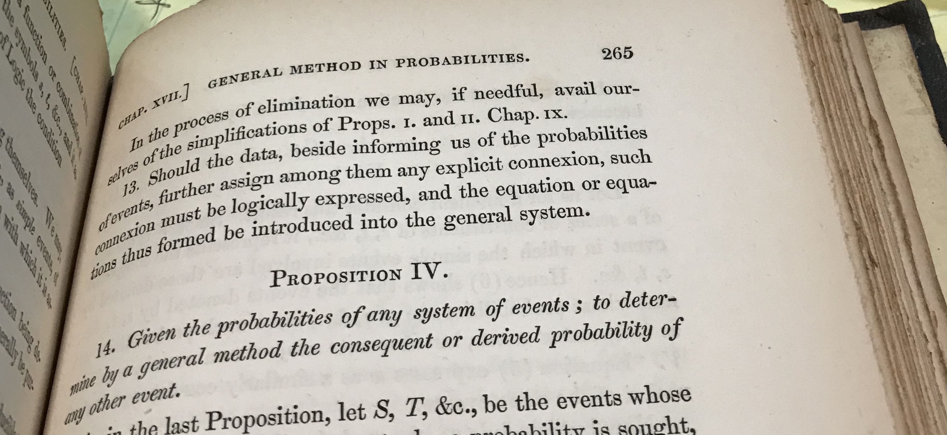
In the following set of models, the target of the analysis is the average causal effect (ACE) of a treatment X on an outcome Y, which stands for the expected increase of Y per unit of a controlled increase in X. Observed variables will be designated by black dots and unobserved variables by white empty circles. Variable Z (highlighted in red) will represent the variable whose inclusion in the regression is to be decided, with “good control” standing for bias reduction, “bad control” standing for bias increase and “netral control” when the addition of Z does not increase nor reduce bias. For this last case, we will also make a brief remark about how Z could affect the precision of the ACE estimate.
Models
Models 1, 2 and 3 – Good Controls
In model 1, Z stands for a common cause of both X and Y. Once we control for Z, we block the back-door path from X to Y, producing an unbiased estimate of the ACE.
In models 2 and 3, Z is not a common cause of both X and Y, and therefore, not a traditional “confounder” as in model 1. Nevertheless, controlling for Z blocks the back-door path from X to Y due to the unobserved confounder U, and again, produces an unbiased estimate of the ACE.
Models 4, 5 and 6 – Good Controls
When thinking about possible threats of confounding, one needs to keep in mind that common causes of X and any mediator (between X and Y) also confound the effect of X on Y. Therefore, models 4, 5 and 6 are analogous to models 1, 2 and 3 — controlling for Z blocks the backdoor path from X to Y and produces an unbiased estimate of the ACE.
Model 7 – Bad Control
We now encounter our first “bad control”. Here Z is correlated with the treatment and the outcome and it is also a “pre-treatment” variable. Traditional econometrics textbooks would deem Z a “good control”. The backdoor criterion, however, reveals that Z is a “bad control”. Controlling for Z will induce bias by opening the backdoor path X ← U1→ Z← U2→Y, thus spoiling a previously unbiased estimate of the ACE.
Model 8 – Neutral Control (possibly good for precision)
Here Z is not a confounder nor does it block any backdoor paths. Likewise, controlling for Z does not open any backdoor paths from X to Y. Thus, in terms of bias, Z is a “neutral control”. Analysis shows, however, that controlling for Z reduces the variation of the outcomevariable Y, and helps improve the precision of the ACE estimate in finite samples.
Model 9 – Neutral control (possibly bad for precision)
Similar to the previous case, here Z is “neutral” in terms of bias reduction. However, controlling for Z will reduce the variation of treatment variable X and so may hurt the precision of the estimate of the ACE in finite samples.
Model 10 – Bad control
We now encounter our second “pre-treatment” “bad control”, due to a phenomenon called “bias amplification” (read more here). Naive control for Z in this model will not only fail to deconfound the effect of X on Y, but, in linear models, will amplify any existing bias.
Models 11 and 12 – Bad Controls
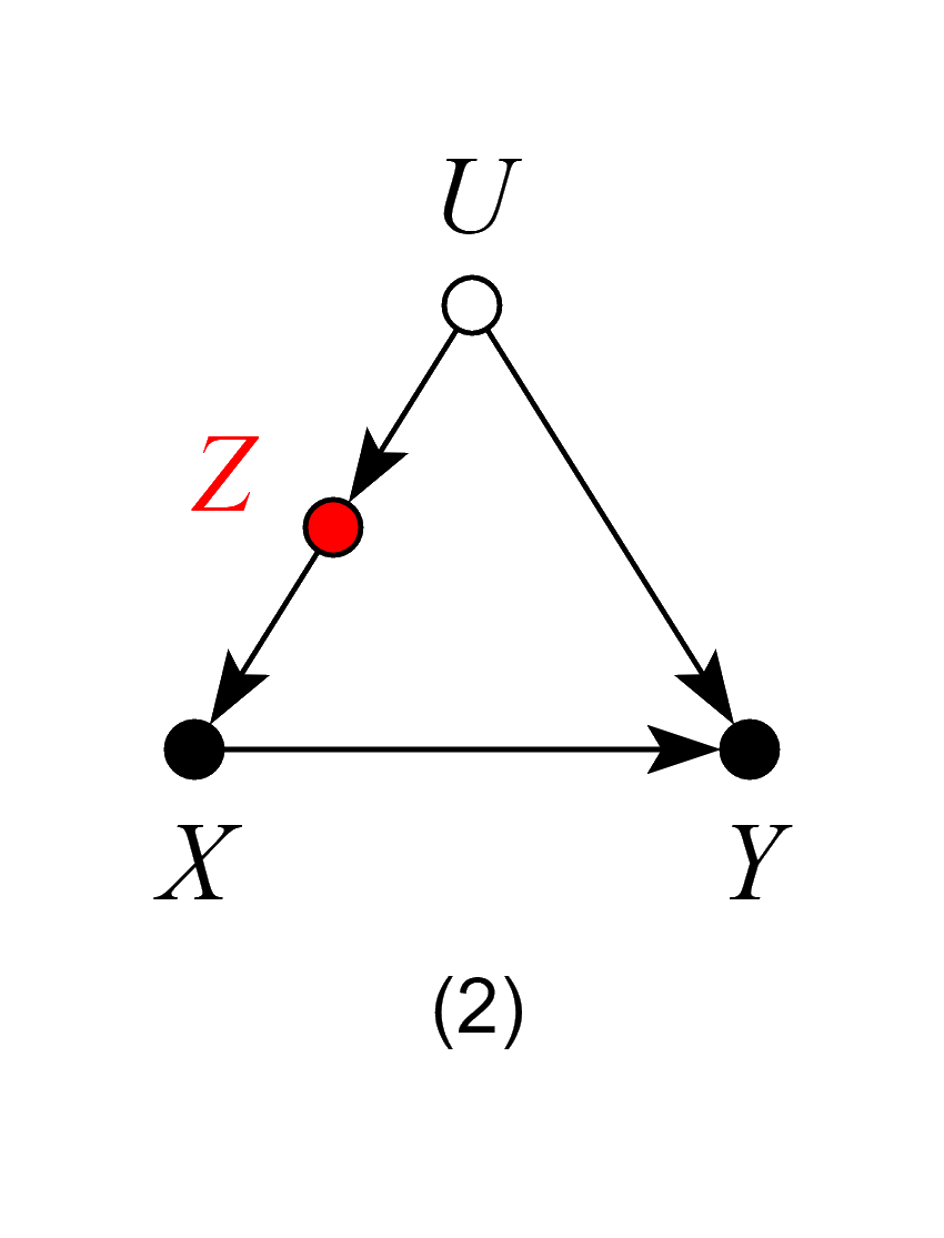
If our target quantity is the ACE, we want to leave all channels through which the causal effect flows “untouched”.
In Model 11, Z is a mediator of the causal effect of X on Y. Controlling for Z will block the very effect we want to estimate, thus biasing our estimates.
In Model 12, although Z is not itself a mediator of the causal effect of X on Y, controlling for Z is equivalent to partially controlling for the mediator M, and will thus bias our estimates.
Models 11 and 12 violate the backdoor criterion, which excludes controls that are descendants of the treatment along paths to the outcome.
Model 13 – Neutral control (possibly good for precision)
At first look, model 13 might seem similar to model 12, and one may think that adjusting for Z would bias the effect estimate, by restricting variations of the mediator M. However, the key difference here is that Z is a cause, not an effect, of the mediator (and, consequently, also a cause of Y). Thus, model 13 is analogous to model 8, and so controlling for Z will be neutral in terms of bias and may increase precision of the ACE estimate in finite samples.
Model 14 – Neutral controls (possibly helpful in the case of selection bias)
Contrary to econometrics folklore, not all “post-treatment” variables are inherently bad controls. In models 14 and 15 controlling for Z does not open any confounding paths between X and Y. Thus, Z is neutral in terms of bias. However, controlling for Z does reduce the variation of the treatment variable X and so may hurt the precision of the ACE estimate in finite samples. Additionally, in model 15, suppose one has only samples with W = 1 recorded (a case of selection bias). In this case, controlling for Z can help obtaining the W-specific effect of X on Y, by blocking the colliding path due to W.
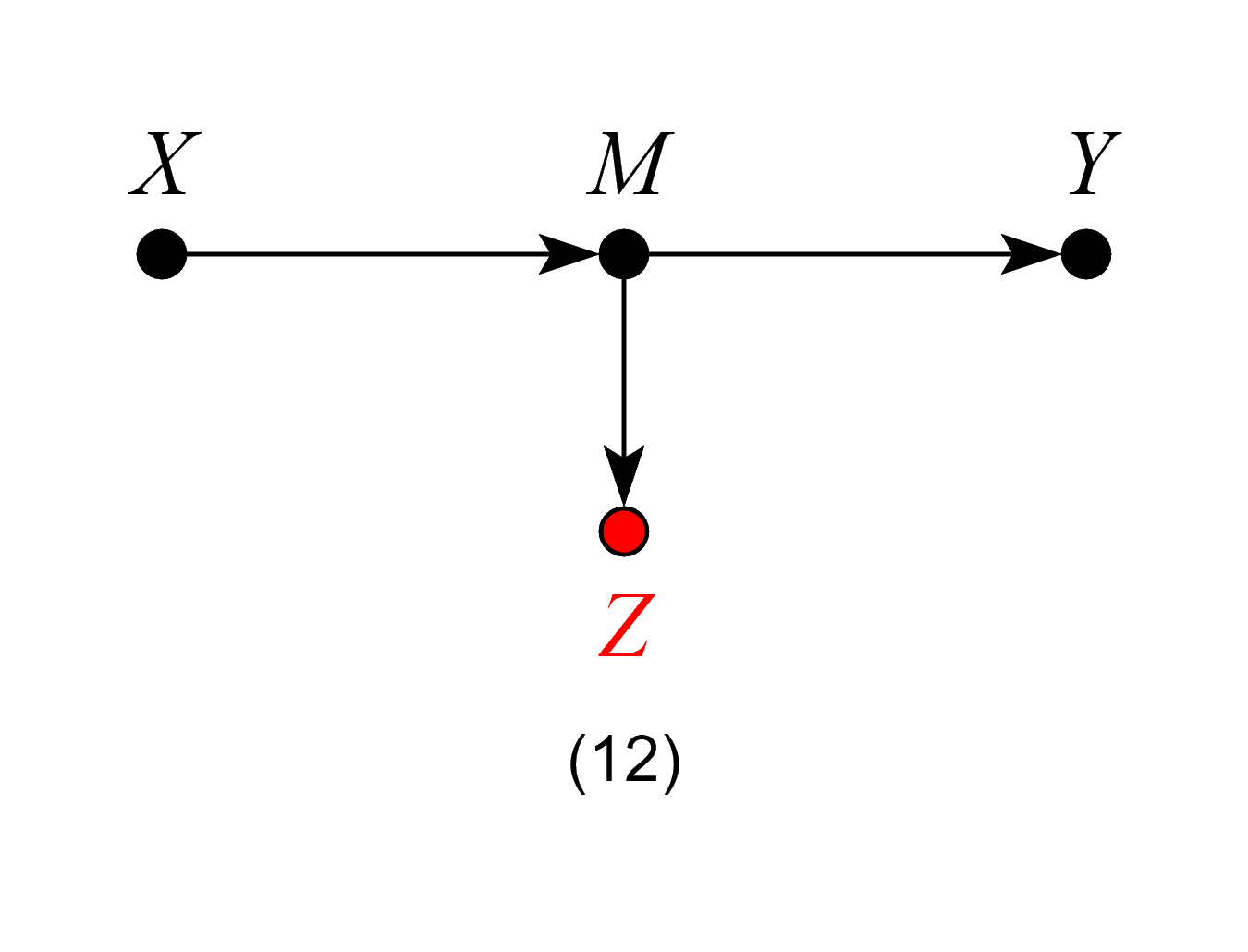
Model 16 – Bad control
Contrary to Models 14 and 15, here controlling for Z is no longer harmless, since it opens the backdoor path X → Z ← U → Y and so biases the ACE.
Model 17 – Bad Control
Here, Z is not a mediator, and one might surmise that, as in Model 14, controlling for Z is harmless. However, controlling for the effects of the outcome Y will induce bias in the estimate of the ACE, making Z a “bad control”. A visual explanation of this phenomenon using “virtual colliders” can be found here.
Model 17 is usually known as a “case-control bias” or “selection bias”. Finally, although controlling for Z will generally bias numerical estimates of the ACE, it does have an exception when X has no causal effect on Y. In this scenario, X is still d-separated from Y even after conditioning on Z. Thus, adjusting for Z is valid for testing whether the effect of X on Y is zero.
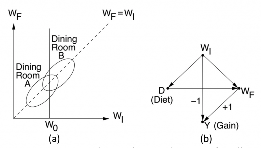
This post aims to provide further insight to readers of “Book of Why” (BOW) (Pearl and Mackenzie, 2018) on Lord’s paradox and the simple way this decades-old paradox was resolved when cast in causal language. To recap, Lord’s paradox (Lord, 1967; Pearl, 2016) involves two statisticians, each using what seems to be a reasonable strategy of analysis, yet reaching opposite conclusions when examining the data shown in Fig. 1 (a) below.
Figure 1: Wainer and Brown’s revised version of Lord’s paradox and the corresponding causal diagram.
The story, in the form described by Wainer and Brown (2017) reads:
“A large university is interested in investigating the effects on the students of the diet provided in the university dining halls …. Various types of data are gathered. In particular, the weight of each student at the time of his arrival in September and his weight the following June (WF) are recorded.”
The first statistician (named John) looks at the weight gains associated with the two dining halls, find them equally distributed, and naturally concludes that Diet has no effect on Gain. The second statistician (named Jane) uses the initial weight (WI) as a covariate and finds that, for every level of WI, the final weight (WF) distribution for Hall B is shifted above that of Hall A. Thus concluding Diet has an effect on Gain. Who is right?
The Book of Why resolved this paradox using causal analysis. First, noting that at issue is “the effect of Diet on weight Gain”, a causal model is postulated, in the form of the diagram of Fig. 1(b). Second, noting the WIis the only confounder of Diet and Gain, Jane was declared “unambiguously correct” and John “incorrect”.
The Critics
The simplicity of this solution invariably evokes skepticism among statisticians. “But how can we be sure of the diagram?” they ask. This kind of skepticism is natural since, statisticians are not trained in postulating causal assumptions, that is, assumptions that cannot be articulated in the language of mainstream statistics, and cannot therefore be tested using the available data. However, after reminding the critics that the contention between John and Jane surrounds the notion of “effect”, and that “effect” is a causal, not statistical notion, enlightened statisticians accept the idea that diagrams need to be drawn and that the one in Fig. 1(b) is reasonable; its main assumptions are: Diet does not affect the initial weight and the initial weight is the only factor affecting both Diet and final weight.
A series of recent posts by S. Senn, however, introduced a new line of criticism into our story (Senn, 2019). It focuses on the process by which the data of Fig. 1(a) was generated, and invokes RCT considerations such as block design, experiments with many halls, analysis of variance, standard errors, and more. Statisticians among my Twitter followers “liked” Senn’s critiques and I am not sure whether they were convinced by my argument that Lord’s paradox has nothing to do with experimental procedures. In other words, the conflict between John and Jane persists even when the data is generated by clean and un-complicated process, as the one depicted in Fig. 1(b).
Senn’s critiques can be summarized thus (quoted):
“I applied John Nedler’s experimental calculus [5, 6] … and came to the conclusion that the second statistician’s solution is only correct given an untestable assumption and that even if the assumption were correct and hence the estimate were appropriate, the estimated standard error would almost certainly be wrong.”
My response was:
Lord’s paradox is about causal effects of Diet. In your words: “diet has no effect” according to John and “diet does have an effect” according to Jane. We know that, inevitably, every analysis of “effects” must rely on causal, hence “untestable assumptions”. So BOW did a superb job in calling the attention of analysts to the fact that the nature of Lord’s paradox is causal, hence outside the province of mainstream statistical analysis. This explains why I agree with your conclusion that “the second statistician’s solution is only correct given an untestable assumption”. Had you concluded that we can decide who is correct without relying on “an untestable assumption”, you and Nelder would have been the first mortals to demonstrate the impossible, namely, that assumption-free correlation does imply causation.
Now let me explain why your last conclusion also attests to the success of BOW. You conclude: “even if the assumption were correct, … the estimated standard error would almost certainly be wrong.”
The beauty of Lord’s paradox is that it demonstrates the surprising clash between John and Jane in purely qualitative terms, with no appeal to numbers, standard errors, or confidence intervals. Luckily, the surprising clash persists in the asymptotic limit where Lord’s ellipses represent infinite samples, tightly packed into those two elliptical clouds.
Some people consider this asymptotic abstraction to be a “limitation” of graphical models. I consider it a blessing and a virtue, enabling us, again, to separate things that matter (clash over causal effects) from those that don’t (sample variability, standard errors, p-values etc.). More generally, it permits us to separate issues of estimation, that is, going from samples to distributions, from those of identification, that is, going from distributions to cause-effect relationships. BOW goes to great length explaining why this last stage presented an insurmountable hurdle to analysts lacking the appropriate language of causation.
Note that BOW declares Jane to be “unambiguously correct” in the context of the causal assumptions displayed in the diagram (Fig.1 (b)) where Diet is shown NOT to influence initial weight, and the initial weight is shown to be the (only) factor that makes students prefer one diet or another. Changing these assumptions may lead to another problem and another resolution but, once we agree with the assumptions our choice of Jane as the correct statistician is “unambiguously correct”
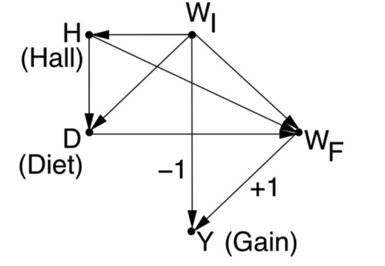
As an example (requested on Twitter) if dining halls have their own effect on weight gain (say Hall-A provides free weight-watching instructions to diners) our model will change as depicted in Fig 2. In this setup, WI is no longer a sole confounder and both WI and Hall need to be adjusted to obtain the effect of Diet on Gain. In other words, Jane will no longer be “correct” unless she analyzes each stratum of the Diet-Hall combination and finds preference of Diet-A over Diet-B.
Figure 2: Separating Diet from Hall in Lord’s Story
New Insights
The upsurge of interest in Lord’s paradox gives me an opportunity to elaborate on another interesting aspect of our Diet-weight model, Fig. 1.
Having concluded that Statistician-2 (Jane) is “unambiguously correct” and that Statistician-1 (John) is wrong, an astute reader would ask: “And what about the sure-thing principle? Isn’t the overall gain just an average of the stratum-specific gains?” (where each stratum represents a level of the initial weight WI). Previously, in the original version of the paradox (Fig. 6.8 of BOW) we dismissed this intuition by noting that WI was affected by the causal variable (Sex) but, now, with the arrow pointing from WI to D we can no longer use this argument. Indeed, the diagram tells us (using the back-door criterion) that the causal effect of D on Y can be obtained by adjusting for the (only) confounder, WI, yielding:
P(Y|do(Diet)) = ∑WIP(Y|Diet,WI) P(WI)
In other words, the overall gain resulting from administering a given diet to everyone is none other but the gain observed in a given diet-weight group, averaged over the weight. How is it possible then for the latter to be positive (as seen from the shifted ellipses) and, simultaneously, for the former to be zero (as seen by the perfect alignment of the ellipses along the WI = WF line)
One would be tempted to suggest that data matching the ellipses of Fig 6.9(a) can never be generated by the model of Fig. 6.9(b) , in which WIis the only confounder? But this could not possibly be the case, because we know that the model has no refuting implications, so it cannot be refuted by the position of the two ellipses.
The answer is that the sure-thing principle applies to causal effects, not to statistical associations. The perfect alignment of the ellipses does not mean that the effect of Diet on Gain is zero; it means only that the Gain is statistically independent of Diet:
P(Gain|Diet=A) = P(Gain|Diet=B)
not that Gain is causally unaffected by Diet. In other words, the equality above does not imply the equality
P(Gain|do(Diet=A)) = P(Gain|do(Diet=B))
which statistician-1 (John) wants us to believe.
Our astute student will of course question this explanation and, pointing to Fig. 1(b), will ask: How can Gain be independent of Diet when the diagram shows them connected? The answer is that the three paths connecting Diet and Gain cancel each other in such a way that an overall independence shows up in the data,
Conclusions
Lord’s paradox starts with a clash between two strong intuitions: (1) To get the effect we want, we must make “proper allowances” for uncontrolled preexisting differences between groups” (i.e. initial weights) and (2) The overall effect (of Diet on Gain) is just the average of the stratum-specific effects. Like the bulk of human intuitions, these two are CAUSAL. Therefore, to reconcile the apparent clash between them we need a causal language; statistics alone won’t do.
The difficulties that generations of statisticians have had in resolving this apparent clash stem from lacking a formal language to express the two intuitions as well as the conditions under which they are applicable. Missing were: (1) A calculus of “effects” and its associated causal sure-thing principle and (2) a criterion (back door) for deciding when “proper allowances for preexisting conditions” is warranted. We are now in possession of these two ingredients, and we should enjoy the power of causal analysis to resolve this paradox, which generations of statisticians have found intriguing, if not vexing. We should also feel empowered to resolve all the paradoxes that surface from the causation-association confusion that our textbooks have bestowed upon us.
References
Lord, F.M. “A paradox in the interpretation of group comparisons,” Psychological Bulletin, 68(5):304-305, 1967.
Pearl, J. “Lord’s Paradox Revisited — (Oh Lord! Kumbaya!)”, Journal of Causal Inference, Causal, Casual, and Curious Section, 4(2), September 2016. https://ftp.cs.ucla.edu/pub/stat_ser/r436.pdf
Wainer and Brown, L.M., “Three statistical paradoxes in the interpretation of group differences: Illustrated with medical school admission and licensing data,” in C.R. Rao and S. Sinharay (Eds.), Handbook of Statistics 26: Psychometrics, North Holland: Elsevier B.V., pp. 893-918, 2007.
Dear Conrad, Following your exchange with Judea, we would like to present concrete examples of how graphical tools can help determine whether a variable qualifies as an instrument. We use the example of job training program which Imbens used in his paper on instrumental variables.
In this example, the goal is to estimate the effect of a training program (X) on earnings (Y). Imbens suggested proximity (Z) as a possible instrument to assess the effect of X on Y. He then mentioned that the assumption that Z is independent of the potential outcomes {Yx} is a strong one, noting that this can be made more plausible by conditioning on covariates.
To illustrate how graphical models can be used in determining the plausibility of the exclusion restriction, conditional on different covariates, let us consider the following scenarios.
Scenario 1. Suppose that the training program is located in the workplace. In this case, proximity (Z) may affect the numbers of hours employees spend at the office (W) since they spend less time commuting, and this, in turn, may affect their earnings (Y).
Scenario 2. Suppose further that the efficiency of the workers (unmeasured) affects both the number of hours (W) and their salary (Y). (This is represented in the graph through the inclusion of a bidirected arrow between W and Y.)
Scenario 3. Suppose even further that this is a high-tech industry and workers can easily work from home. In this case, the number of hours spent at the office (W) has no effect on earnings (Y). (This is represented in the graph through the removal of the directed arrow from W to Y.)
Scenario 4. Finally, suppose that worker efficiency also affects whether they attend the program because less efficient workers are more likely to benefit from training. (This is represented in the graph through the inclusion of a bidirected arrow from W to X.)
The following figures correspond to the scenarios discussed above.
The reasons we like to work with graphs on such problems is, first, we can represent these scenarios clearly and unambiguously and, second, we can derive the answer in each of these scenarios by inspection of the causal graphs. Here are our answers: (We assume a linear model. For nonparametric, use LATE.)
Scenario 1. Is the effect of X on Y identifiable? Yes How? Using Z as an instrument conditioning on W and the effect is equal to r_{zy.w} / r_{zx.w}. Testable implications? (W independent X given Z)
Scenario 2. Is the effect of X on Y identifiable? No How? n/a. Testable implications? (W independent X given Z)
Scenario 3. Is the effect of X on Y identifiable? Yes How? Using Z as an instrument and the effect is equal to r_{zy} / r_{zx}. Remark. Conditioning on W disqualifies Z as an instrument. Testable implications? (W independent X given Z)
Scenario 4. Is the effect of X on Y identifiable? Yes How? Using Z as an instrument and the effect is equal to r_{zy} / r_{zx}. Conditioning on W disqualifies Z as an instrument. Testable implications?
In summary, the examples demonstrate Imben’s point that judging whether a variable (Z) qualifies as an instrument hinges on substantive assumptions underlying the problem being studied. Naturally, these assumptions follow from the causal story about the phenomenon under study. We believe graphs can be an attractive language to solve this type of problem for two reasons. First, it is a transparent representation in which researchers can express the causal story and discuss its plausibility. Second, as a formal representation of those assumptions, it allows us to apply mechanical procedures to evaluate the queries of interest. For example, whether a specific set Z qualifies as an instrument; whether there exists a set Z that qualifies as instrument; what are the testable implications of the causal story.
We hope the examples illustrate these points. Bryant and Elias

 In chapter 19, Boole first showed the following: