Race, COVID Mortality, and Simpson’s Paradox (by Dana Mackenzie)
Summary
This post reports on the presence of Simpson’s paradox in the latest CDC data on coronavirus. At first glance, the data may seem to support the notion that coronavirus is especially dangerous to white, non-Hispanic people. However, when we take into account the causal structure of the data, and most importantly we think about what causal question we want to answer, the conclusion is quite different. This gives us an opportunity to emphasize a point that was perhaps not stressed enough in The Book of Why, namely that formulation of the right query is just as important as constructing the right causal model.
Race, COVID Mortality, and Simpson’s Paradox
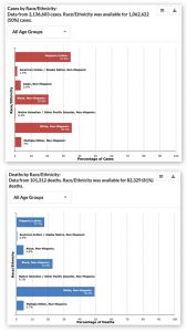
Recently I was perusing the latest data on coronavirus on the Centers for Disease Control (CDC) website. When I got to the two graphs shown below, I did a double-take.
 (click on the graph to enlarge)
COVID-19 Cases and Deaths by Race and Ethnicity (CDC, 6/30/2020).
This is a lot to take in, so let me point out what shocked me. The first figure shows that 35.3 percent of diagnosed COVID cases were in “white, non-Hispanic” people. But 49.5 percent of COVID deaths occurred to people in this category. In other words, whites who have been diagnosed as COVID-positive have a 40 percent greater risk of death than non-whites or Hispanics who have been diagnosed as COVID-positive.
This, of course, is the exact opposite of what we have been hearing in the news media. (For example, Graeme Wood in The Atlantic: “Black people die of COVID-19 at a higher rate than white people do.”) Have we been victimized by a media deception? The answer is NO, but the explanation underscores the importance of understanding the causal structure of data and interrogating that data using properly phrased causal queries.
Let me explain, first, why the data above cannot be taken at face value. The elephant in the room is age, which is the single biggest risk factor for death due to COVID-19. Let’s look at the CDC mortality data again, but this time stratifying by age group.
|
Race → |
White, non-Hispanic |
Others |
||
|
Age ↓ |
Cases |
Deaths |
Cases |
Deaths |
|
0-4 |
23.9% |
53.3% |
76.1% |
46.7% |
|
5-17 |
19% |
9.1% |
81% |
90.9% |
|
18-29 |
29.8% |
18.9% |
70.2% |
81.1% |
|
30-39 |
26.5% |
16.4% |
73.5% |
83.6% |
|
40-49 |
26.5% |
16.4% |
73.5% |
83.6% |
|
50-64 |
36.4% |
16.4% |
63.6% |
83.6% |
|
65-74 |
45.9% |
40.8% |
54.1% |
59.2% |
|
75-84 |
55.4% |
52.1% |
44.6% |
47.9% |
|
85+ |
69.6% |
67.6% |
30.4% |
32.4% |
|
ALL AGES |
35.4% |
49.5% |
64.6% |
50.5% |
This table shows us that in every age category (except ages 0-4), whites have a lower case fatality rate than non-whites. That is, whites make up a lower percentage of deaths than cases. But when we aggregate all of the ages, whites have a higher fatality rate. The reason is simple: whites are older.
According to U.S. census data (not shown here), 9 percent of the white population in the United States is over age 75. By comparison, only 4 percent of Black people and 3 percent of Hispanic people have reached the three-quarter-century mark. People over age 75 are exactly the ones who are at greatest risk of dying from COVID (and by a wide margin). Thus the white population contains more than twice as many high-risk people as the Black population, and three times as many high-risk people as the Hispanic population.
People who have taken a course in statistics may recognize the phenomenon we have uncovered here as Simpson’s paradox. To put it most succinctly, and most paradoxically, if you tell me that you are white and COVID-positive, but do not tell me your age, I have to assume you have a higher risk of dying than your neighbor who is Black and COVID-positive. But if you do tell me your age, your risk of dying becomes less than your neighbor who is Black and COVID-positive and the same age. How can that be? Surely the act of telling me your age should not make any difference to your medical condition.
In introductory statistics courses, Simpson’s paradox is usually presented as a curiosity, but the COVID data shows that it raises a fundamental question. Which is a more accurate picture of reality? The one where I look only at the aggregate data and conclude that whites are at greater risk of dying, or the one where I break the data down by age and conclude that non-whites are at greater risk?
The general answer espoused by introductory statistics textbooks is: control for everything. If you have age data, stratify by age. If you have data on underlying medical conditions, or socioeconomic status, or anything else, stratify by those variables too.
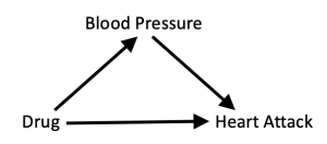
This “one-size-fits-all” approach is misguided because it ignores the causal story behind the data. In The Book of Why, we look at a fictional example of a drug that is intended to prevent heart attacks by lowering blood pressure. We can summarize the causal story in a diagram:
Here blood pressure is what we call a mediator, an intervening variable through which the intervention produces its effect. We also allow for the possibility that the drug may directly influence the chances of a heart attack in other, unknown ways, by drawing an arrow directly from “Drug” to “Heart Attack.”
The diagram tells us how to interrogate the data. Because we want to know the drug’s total effect on the patient, through the intended route as well as other, unintended routes, we should not stratify the data. That is, we should not separate the experimental data into “high-blood-pressure” and “low-blood-pressure” groups. In our book, we give (fictitious) experimental data in which the drug increases the risk of heart attack among people in the low-blood-pressure group and among people in the high-blood-pressure group (presumably because of side effects). But at the same time, and most importantly, it shifts patients from the high-risk high-blood-pressure group into the low-risk low-blood-pressure group. Thus its total effect is beneficial, even though its effect on each stratum appears to be harmful.
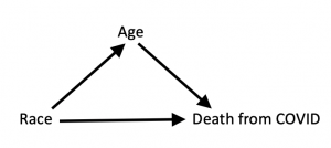
It’s interesting to compare this fictitious example to the all-too-real COVID example, which I would argue has a very similar causal structure:
The causal arrow from “race” to “age” means that your race influences your chances of living to age 75 or older. In this diagram, Age is a mediator between Race and Death from COVID; that is, it is a mechanism through which Race acts. As we saw in the data, it’s quite a potent mechanism; in fact, it accounts for why white people who are COVID-positive die more often.
Because the two causal diagrams are the same, you might think that in the second case, too, we should not stratify the data; instead we should use the aggregate data and conclude that COVID is a disease that “discriminates” against whites.
However, this argument ignores the second key ingredient I mentioned earlier: interrogating the data using correctly phrased causal queries.
What is our query in this case? It’s different from what it was in the drug example. In that case, we were looking at the drug as a preventative for a heart attack. If we were to look at the COVID data in the same way, we would ask, “What is the total lifetime effect of intervening (before birth) to change a person’s race?” And yes: if we could perform that intervention, and if our sole objective was to prevent death from COVID, we would choose to change our race from white to non-white. The “benefit” of that intervention would be that we would never live to an age where we were at high risk of dying from COVID.
I’m sure you can see, without my even explaining it, that this is not the query any reasonable person would pose. “Saving” lives from COVID by making them end earlier for other reasons is not a justifiable health policy.
Thus, the query we want to interrogate the data with is not “What is the total effect?” but “What is the direct effect?” As we explain on page 312 of The Book of Why, this is always the query we are interested in when we talk about discrimination. If we want to know whether our health-care system discriminates against a certain ethnic group, then we want to hold all other variables constant that might account for the outcome, and see what is the effect of changing Race alone. In this case, that means stratifying the data by Age, and the result is that we do see evidence of discrimination. Non-whites do worse at (almost) every age. As Wood writes, “The virus knows no race or nationality; it can’t peek at your driver’s license or census form to check whether you are black. Society checks for it, and provides the discrimination on the virus’s behalf.”
To reiterate: The causal story here is identical to the Drug-Blood Pressure-Heart Attack example. What has changed is our query. Precision is required both in formulating the causal model, and in deciding what is the question we want to ask of it.
I wanted to place special emphasis on the query because I recently was asked to referee an article about Simpson’s paradox that missed this exact point. Of course I cannot tell you more about the author or the journal. (I don’t even know who the author is.) It was a good article overall, and I hope that it will be published with a suitable revision.
In the meantime, there is plenty of room for further exploration of the coronavirus epidemic with causal models. Undoubtedly the diagram above is too simple; unfortunately, if we make it more realistic by including more variables, we may not have any data available to interrogate. In fact, even in this case there is a huge amount of missing data: 51 percent of the COVID cases have unknown race/ethnicity, and 19 percent of the deaths. Thus, while we can learn an excellent lesson about Simpson’s paradox and some probable lessons about racial inequities, we have to present the results with some caution. Finally, I would like to draw attention to something curious in the CDC data: The case fatality rate for whites in the youngest age group, ages 0-4, is much higher than for non-whites. I don’t know how to explain this, and I would think that someone with an interest in pediatric COVID cases should investigate.


I found this article very interesting and have been noodling over a disparity in the data in Toronto. Specifically, the city is reporting higher instances of female cases (53.1%). I found this confounding because much of the other world-wide data indicates that males are more likely to die from COVID 19 symptoms. I think that similar to what you have demonstrated in this article, Simpson’s Paradox may be the culprit. I am surmising that since women live longer than men and the 70+ are group is more likely to die from COVID 19 the 53.1 % number may be skewing the outcome and if the data was stratified by age, race, and sex the underlying data might indicate that men are more likely to succumb to COVID 19. Interesting stuff!
Comment by Sharon — July 7, 2020 @ 3:22 pm
Thank you for the explanation. I think I’m gonna study stats when I go back to school. I love this stuff.
Comment by Frank Garvis — July 8, 2020 @ 1:31 pm
Thanks for a brilliant explanation!
Comment by Tal van Dijk — July 8, 2020 @ 7:42 pm
Thank you very much for the article! I have one question though. Even if you are interested in the direct effect of “race” you do not want to include variables through which “racial discrimination” works, right? For example, one should not stratify by household income. It seems to me that it is not so much about direct vs. total effects but rather about asking the right question in terms of the underlying causing variable. Is that correct?
Comment by Christian — July 9, 2020 @ 5:13 am
While I applaud the very idea that one needs to look closely at the causal structure, one needs to know quite a bit that is hard to know. So I disagree that ” If we want to know whether our health-care system discriminates against a certain ethnic group, then we want to hold all other variables constant that might account for the outcome, and see what is the effect of changing Race alone.”
We don’t want to hold all those other variables statistically constant, because that may involve conditioning on a collider if there are unmeasured variables that influence health outcomes and also influence any of the variables we condition on that are effects of ethnicity. Reducing such errors is part of what sound search procedures do. That aside, I think we should be plenty interested in the relatively indirect effects of variables that are associated with ethnicity, either as an effect or through a common cause, e.g., poverty, insurance. If the question is specifically whether some groups get worse medical treatment than others given that they are diagnosed, that is a matter involving disease progression at the time of detection, disposition to seek treatment, delays in treatment, insurance, quality of local hospitals, and so on.
Comment by Clark Glymour — August 18, 2020 @ 8:46 pm
One other input into the graph is also immigration and birth rate. There is not a fixed population aging, but differential changes in the population. New immigrants are more likely to be younger than 75 years old and more likely to be in the “others” category. I do not really like calling it an “others” category, it would be nice to have other language.
Comment by LauraK — February 9, 2021 @ 3:37 pm
Because do(race) should not have an impact on age, wouldn’t a model where race and age are coufounded (linked by a bi-edge) be more accurate?
The problem would then rather be the estimation of the total effect through backdoor adjustment rather the distinction between total and direct effect.
Comment by Loïc — February 24, 2021 @ 4:58 pm