Causal Analysis in Theory and Practice

March 17, 2023

Personalized Decision Making under Concurrent-Controlled RCT Data

Filed under: Uncategorized — Scott Mueller @ 2:31 am

Scott Mueller and Judea Pearl

Introduction

This note supplements the analysis of [Mueller and Pearl 2023] by introducing an important restriction on the data obtained from Randomized Control Trials (RCT). In Mueller and Pearl, it is assumed that RCTs provide estimates of two probabilities, \(P(y_t)\) and \(P(y_c)\), standing for the probability of the outcome \(Y\) under treatment and control, respectively. In medical practices, however, these two quantities are rarely reported separately; only their difference \(\text{ATE} = P(y_t)-P(y_c)\) is measured, estimated, and reported. The reason is that the individual effects, \(P(y_t)\) and \(P(y_c)\), are suspect of contamination by selection bias and placebo effects. These two imperfections are presumed to cancel out by a method called “Concurrent Control” [Senn 2010] in which subjects in both treatment and control arms are measured simultaneously and only the average difference, ATE, is counted1.

This note establishes bounds on \(P(\text{benefit})\) and \(P(\text{harm})\) under the restriction that RCTs provide only an assessment of ATE, not of the individual causal effects \(P(y_t)\) and \(P(y_c)\). We will show that the new restriction, though leading to wider bounds, still permits the extraction of meaningful information on individual harm and benefit and, when combined with observational data, can be extremely valuable in personalized decision making.

Our results can be summarized in the following two inequalities. The first inequality bounds PNS (same as \(P(\text{benefit})\)) without observational data, and the second bounds PNS using both ATE and observational data in the form of \(P(X, Y)\).

With just the ATE, PNS is bounded as:

$$\begin{equation} \max\{0, \text{ATE}\} \leqslant \text{PNS} \leqslant \min\{1, \text{ATE} + 1\}. \end{equation}$$

The lower bound is above zero when ATE is positive, and the upper bound is lower than 1 when ATE is negative.

When we combine ATE with observational data, the lower bound remains the same, but the upper bound changes to yield:

$$\begin{equation} \max\{0, \text{ATE}\} \leqslant \text{PNS} \leqslant \min\left\{\begin{array}{r} P(x,y) + P(x’,y’),\\ \text{ATE} + P(x, y’) + P(x’, y) \end{array}\right\}. \end{equation}$$

The upper bound in (2), is always lower than (or equal to) the one in (1), because both \(P(x,y) + P(x’,y’) \leqslant 1\) and \(P(x, y’) + P(x’, y) \leqslant 1\).

In Appendix we will present the derivations of Eqs. (1) and (2), whereas in the following section, we discuss some of their ramifications.

Footnote
1
See footnote 11 in [Mueller and Pearl 2023] and [Pearl 2013] for ways in which selection bias can be eliminated when linearity is assumed (after scaling).

How observational data inform PNS (or P(benefit))

The bounds on PNS produced by Eqs. (1) and (2) can be visualized interactively2. To show the contrast between Eq. (1) and Eq. (2), Fig. 1 displays the allowable values of PNS for various levels of ATE, assuming no observational information is available (i.e., Eq. (1)). We see, for example, that for \(\text{ATE} = 0\) (left vertical dashed line), the bound is vacuous (\(0 \leqslant \text{PNS} \leqslant 1\)), while for \(\text{ATE}=0.5\) (right vertical dashed line), we have \(\frac12 \leqslant \text{PNS} \leqslant 1\) — a somewhat more informative bound, but still rather trivial.

Figure 1: The green area represents possible PNS values for the given ATE, while the white areas represent values not achievable by PNS.

Figure 2 displays the allowable values of PNS when observational data are available. We see that for \(\text{ATE} = 0\) (left vertical dashed line), we now have \(0 \leqslant \text{PNS} \leqslant \frac12\), whereas for \(\text{ATE} = 0.5\) (right vertical dashed line), we now have a point estimate \(\text{PNS} = \frac12\), assuring us that exactly 50\% of all subjects will benefit from the treatment (and none will be harmed by it).

Figure 2: The green area represents possible PNS values for the given ATE, while the gray areas represent values of ATE that are incompatible with the assumed observational information: P(y|x) = P(y|x’) = P(x) = 0.5.

When observational data become less symmetric, say \(P(x)=0.5\), \(P(y|x)=0.9\), and \(P(y|x’)=0.1\), the regions of possible and impossible PNS values shift significantly. Moving the sliders for \(P(x)\), \(P(y|x)\), and \(P(y|x’)\) to the above values produces the graph shown in Figure 3. This time, when \(\text{ATE} = 0\) (left vertical dashed line), the bounds on PNS narrow down to \(0 \leqslant \text{PNS} \leqslant 0.1\), telling us that subjects have a maximum 10\% chance of benefiting from the treatment. When \(\text{ATE}=0.5\) (right vertical dashed line), we have \(\frac12 \leqslant \text{PNS} \leqslant 0.6\), still a narrow width of \(0.1\), with an assurance of at least 50\% chance of benefiting from the treatment.

It should be clear now that consequential information on individual benefit can be obtained even when separate causal effects, \(P(y_x)\) and \(P(y_{x’})\), are unavailable. The same situation holds for \(P(\text{harm})\) as well.

Figure 3: The green area represents possible PNS values for the given ATE and observational probabilities: P(x) = 0.5, P(y|x) = 0.9, P(y|x’) = 0.1.
Footnote
2
Visualization is at https://ate-bounds.streamlit.app.

How Observational Data inform the Probability of Harm P(harm)

The probability of harm is the converse of PNS. We can bound this probability with ATE and with observational data similar to Eqs. (1) and (2). With just the ATE, \(P(\text{harm})\) is bounded as:

$$\begin{equation} \max\{0, -\text{ATE}\} \leqslant \text{PNS} \leqslant \min\{1, 1 – \text{ATE}\}. \end{equation}$$

The lower bound is positive when ATE is positive, and the upper bound is less than \(1\) when ATE is negative. When we combine observational data, a smaller upper bound is possible:

$$\begin{equation} \max\{0, \text{ATE}\} \leqslant \text{PNS} \leqslant \min\left\{\begin{array}{r} P(x,y’) + P(x’,y),\\ P(x, y) + P(x’, y’) – \text{ATE} \end{array}\right\}. \end{equation}$$

Again, the upper bound in (4), is always lower than (or equal to) the one in (3), since \(P(x,y) + P(x’,y’) \leqslant 1\) and \(P(x, y’) + P(x’, y) \leqslant 1\). See Appendix for the derivations of Eqs. (3) and (4).

Figures 4a and 4b depict these bounds under the same conditions as Figures 1 and 2, respectively.

Figure 5, on the other hand, shows very different sets of bounds for the asymmetric case: \(P(x) = 0.5\), \(P(y|x) = 0.9\), and \(P(y|x’) = 0.1\), used in Figure 3. This time, \(0 \leqslant P(\text{harm}) \leqslant 0.1\) when \(\text{ATE}=0\) or \(\text{ATE}=0.5\). This has the same width of \(0.1\) as in the case of PNS, but with a substantially different shape.

Figure 5: The green area represents possible P(harm) values for the given ATE and observational probabilities: P(x)= 0.5, P(y|x) = 0.9, P(y|x’) = 0.1.

Intuition

The intuition behind the PNS lower bound is that the probability of benefiting cannot be less than the positive part of the difference in causal effects. That difference must be explained by benefiting from treatment.

The intuition behind the PNS upper bound is split into two parts. First, the benefiters must be among the individuals who chose treatment and had a successful outcome, \((x, y)\), or those who avoided treatment and had an unsuccessful outcome, \((x’, y’)\). Therefore, one potential upper bound is \(P(x,y) + P(x’,y’)\). Alternatively, since \(\text{ATE} = \text{PNS} – P(\text{harm})\), we get an upper bound on PNS by adding at least the proportion of individuals harmed to ATE. This is precisely the upper bound \(\text{ATE} + P(x, y’) + P(x’, y)\) because the proportion of individuals choosing treatment and having an unsuccessful outcome, \(P(x, y’)\), and the proportion of individuals avoiding treatment and having a successful outcome, \(P(x’, y)\), comprise all individuals harmed by treatment as well as some additional individuals.

Similar reasoning holds for the lower and upper bounds of \(P(\text{harm})\).

Bounds on ATE

In addition to informing PNS and \(P(\text{harm})\), observational data also impose restrictions on ATE, violations of which imply experimental imperfections. We start with Tian and Pearl’s bounds on causal effects [Tian and Pearl 2000]:

$$\begin{align} P(x,y) &\leqslant P(y_x) \leqslant 1 – P(x, y’),\\ P(x’,y) &\leqslant P(y_{x’}) \leqslant 1 – P(x’, y’). \end{align}$$

If we multiply Equation (6) by \(-1\) and add it to Equation (5), we get the following bounds on ATE:

$$\begin{align} P(x,y) + P(x’,y’) – 1 &\leqslant \text{ATE} \leqslant P(x,y) + P(x’,y’). \end{align}$$

While the range of ATE values has a width of \(1\), the location of this range can still alert the experimenter to possible incompatibilities between the observational and experimental data.

Appendix

The lower and upper bounds in Equation (2) follow directly from the Tian-Pearl bounds on PNS. There are two additional possible lower bounds on PNS: \(P(y_x) – P(y)\) and \(P(y) – P(y_{x’})\). Since \(P(y_x) – P(y) = \text{ATE} + P(y_{x’}) – P(y)\) and \(P(y_{x’}) \geqslant 0\), a potential lower bound of \(\text{ATE} – P(y)\) could be added to the \(\max\) function of the left inequality (2). However, the existing lower bound \(\text{ATE}\) subsumes it because \(P(y) \geqslant 0\). Similarly, since \(P(y) – P(y_{x’}) = \text{ATE} – P(y_x) + P(y)\) and \(P(y_x) \leqslant 1\), a potential lower bound of \(\text{ATE} – P(y’)\) could be added to inequalities (2). Again, the existing lower bound \(\text{ATE}\) subsumes it.

There are two additional possible upper bounds on PNS: \(P(y_x)\) and \(P(y’_{x’})\). Since \(P(y_x) = \text{ATE} + P(y_{x’})\) and \(P(y_{x’}) \leqslant 1\), a potential upper bound of \(\text{ATE} + 1\) could be added to the \(\min\) function of the right inequality (2). However, the existing upper bound \(\text{ATE} + P(x, y’) + P(x’, y)\) subsumes it because \(P(x, y’) + P(x’, y) \leqslant 1\). Similarly, since \(P(y’_{x’}) = \text{ATE} + 1 – P(y_x) = \text{ATE} + P(y’_x)\) and \(P(y’_x) \leqslant 1\), a potential upper bound of \(\text{ATE} + 1\) could be added to inequalities (2). Again, the existing upper bound \(\text{ATE} + P(x, y’) + P(x’, y)\) subsumes it.

It may appear that the upper bound might dip below the lower bound, which would be problematic. In particular, either of the following two cases would cause this situation:

$$\begin{align} P(x,y) + P(x’,y’) &< \text{ATE}, \text{or}\\ \text{ATE} + P(x,y') + P(x',y) &< 0. \end{align}$$

Neither of these inequalities can occur because of the inequalities in (7). Inequality (8) cannot occur because of the right inequality of (7). Similarly, inequality (9) cannot occur because of the left inequality of (7).

References

  1. Mueller, Scott and Judea Pearl (2023). “Personalized Decision Making – A Conceptual Introduction”. In: Journal of Causal Inference. url: http://ftp.cs.ucla.edu/pub/stat_ser/r513.pdf.
  2. Pearl, Judea (May 29, 2013). “Linear Models: A Useful “Microscope” for Causal Analysis”. In: Journal of Causal Inference 1.1, pp. 155–170. issn: 2193-3685, 2193-3677. doi: 10.1515/jci-2013-0003. url: https://www.degruyter.com/document/doi/10.1515/jci-2013-0003/html (visited on 03/16/2023).
  3. Senn, Stephen (2010). “Control in Clinical Trials”. In: Proceedings of the Eighth International Conference on Teaching Statistics. url: https://iase-web.org/documents/papers/icots8/ICOTS8_6D2_SENN.pdf.
  4. Tian, Jin and Judea Pearl (2000). “Probabilities of causation: Bounds and identification”. In: Annals of Mathematics and Artificial Intelligence 28.1-4, pp. 287–313. url: http://ftp.cs.ucla.edu/pub/stat_ser/r271-A.pdf.

April 4, 2020

Artificial Intelligence and COVID-19

Filed under: Uncategorized — Judea Pearl @ 8:47 pm

This past week, the Stanford Institute for Human-Centered Artificial Intelligence (HAI) has organized a virtual conference on AI and COVID-19, a video of which is now available. Being unable to attend the conference, I have asked the organizers to share the following note with the participants:

Dear HAI Fellows,

I was unable to attend our virtual conference on “COVID-19 and AI”, but I feel an obligation to share with you a couple of ideas on how AI can offer new insights and new technologies to help in pandemic situations like the one we are facing.

I will describe them briefly below, with the hope that you can discuss them further with colleagues, students, and health-care agencies, whenever opportunities avail themselves.

1. Data interpreting vs. Data Fitting
————–

Much has been said about how ill-prepared our health-care system was/is to cope with catastrophic outbreaks like COVID-19. The ill-preparedness, however, was also a failure of information technology to keep track of and interpret the vast amount of data that have arrived from multiple heterogeneous sources, corrupted by noise and omission, some by sloppy collection and some by deliberate misreporting. AI is in a unique position to equip society with intelligent data-interpreting technology to cope with such situations.

Speaking from my narrow corner of causal inference research, a solid theoretical underpinning of this data fusion problem has been developed in the past decade (summarized in this PNAS paper https://ucla.in/2Jc1kdD), and is waiting to be operationalized by practicing professionals and information management organizations.

A system based on data fusion principles should be able to attribute disparities between Italy and China to differences in political leadership, reliability of tests and honesty in reporting, adjust for such difference and infer behavior in countries like Spain or the US.  AI is in a position to develop a data-interpreting technology on top of the data-fitting technology currently in use.

2. Personalized care and counterfactual analysis
————–

Much of current health-care methods and procedures are guided by population data, obtained from controlled or observational studies. However, the task of going from these data to the level of individual behavior requires counterfactual logic, such as the one formalized and “algorithmitized” by AI researchers in the past three decades.

One area where this development can assist the COVID-19 efforts concerns the question of prioritizing patients who are in “greatest need” for treatment, testing, or other scarce resources. “Need” is a counterfactual notion (i.e., invoking iff conditionals) that cannot be captured by statistical methods alone. A recently posted blog page https://ucla.in/39Ey8sU demonstrates in vivid colors how counterfactual analysis handles this prioritization problem.

Going beyond priority assignment, we should keep in mind that the entire enterprise known as “personalized medicine” and, more generally, any enterprise requiring inference from populations to individuals, rests on counterfactual analysis. AI now holds the most advanced tools for operationalizing this analysis.

Let us add these two methodological capabilities to the ones discussed in the virtual conference on “COVID-19 and AI.” AI should prepare society to cope with the next information tsunami.

Best wishes,

Judea

April 2, 2020

Which Patients are in Greater Need: A counterfactual analysis with reflections on COVID-19

Filed under: Uncategorized — Judea Pearl @ 10:12 pm

Scott Mueller and Judea Pearl

With COVID-19 among us, our thoughts naturally lead to people in greatest need of treatment (or test) and the scarcity of hospital beds and equipment necessary to treat those people. What does “in greatest need” mean? This is a counterfactual notion. People who are most in need have the highest probability of both survival if treated and death if not treated. This is materially different from the probability of survival if treated. The people who will survive if treated include those who would survive even if untreated. We want to focus treatment on people who need treatment the most, not the people who will survive regardless of treatment.

Imagine that a treatment for COVID-19 affects men and women differently. Two patients arrive in your emergency room testing positive for COVID-19, a man and a woman. Which patient is most in need of this treatment? That depends, of course, on the data we have about men and women.

A Randomized Controlled Trial (RCT) is conducted for men, and another one for women. It turns out that men recover \(57\%\) of the time when treated and only \(37\%\) of the time when not treated. Women, on the other hand, recover \(55\%\) of the time when treated and \(45\%\) of the time when not treated. We might be tempted to conclude that, since the treatment is more effective among men than women, \(20\) compared to \(10\) percentage points, that men benefit more from the treatment and, therefore, when resources are limited, men are in greater need for those resources than women. But things are not that simple, especially when treatment is suspect of causing fatal complications in some patients.

Let us examine the data for men and ask what it tells us about the number that truly benefit from the treatment. It turns out that the data can be interpreted in a variety of ways. In one extreme interpretation, the \(20\%\) difference between the treated and untreated amounts to saving the lives of \(20\%\) of the patients who would have died otherwise. In the second extreme interpretation, the treatment saved the lives of all \(57\%\) of those who recovered, and actually killed \(37\%\) of other patients; they would have recovered otherwise, as did the \(37\%\) recoveries in the control group. Thus the percentage of men saved by the treatment could be anywhere between \(20\%\) and \(57\%\), quite a sizable range.

Applying the same reasoning to the women’s data, we find an even wider range. In the first extreme interpretation, \(10\%\) out of \(55\%\) recoveries were saved by the treatment and \(45\%\) would recover anyhow. In the second extreme interpretation, all \(55\%\) of the treated recoveries were saved by the treatment while \(45\%\) were killed by it.

Summarizing, the percentage of beneficiaries may be, for men, anywhere from \(20\%\) to \(57\%\), while for women, anywhere from \(10\%\) to \(55\%\). It should start to be clear now why it’s not so clear that the treatment cures more men than women. Looking at the two intervals in figure 1 below, it is quite possible that as much as \(55\%\) of the women and only \(20\%\) of the men would actually benefit from the treatment.

Figure 1: Percentage of beneficiaries for men vs women

One might be tempted to argue that men are still in greater need because the guarantee for curing a man is higher than that of a woman (\(20\%\) vs \(10\%\)), but that argument would neglect the other possibilities in the spectrum. For example, the possibility that exactly \(20\%\) of men benefit from the treatment and exactly \(55\%\) of women benefit, which would reverse our naive conclusion that men should be preferred.

Such coincidences may appear unlikely at first glance but we will show below that it can occur and, more remarkably, that we can determine when they occur given additional data. But first let us display the extent to which RCTs can lead us astray.

Below is an interactive plot that displays the range of possibilities for every RCT finding. It uses the following nomenclature. Let \(Y\) represent the outcome variable, with \(y = \text{recovery}\) and \(y’ = \text{death}\), and \(X\) represent the treatment variable, with \(x = \text{treated}\) and \(x’ = \text{not treated}\). We denote by \(y_x\) the event of recovery for a treated individual and by \(y_{x’}\) the event of recovery for an untreated individual. Similarly, \(y’_x\) and \(y’_{x’}\) represent the event of death for a treated and an untreated individual, respectively.

Going now to probabilities under experimental conditions, let us denote by \(P(y_x)\) the probability of recovery for an individual in the experimental treatment arm and by \(P(y’_{x’})\) the probability of death for an individual in the control (placebo) arm. “In need” or “cure” stands for the conjunction of the two events \(y_x\) and \(y’_{x’}\), namely, recovery upon treatment and death under no treatment. Accordingly, the probability of benefiting from treatment is equal to \(P(y_x, y’_{x’})\), i.e., the probability that an individual will recover if treated and die if not treated. This quantity is also known as the probability of necessity and sufficiency, denoted PNS in (Tian and Pearl, 2000) since the joint event \((y_x, y’_{x’})\) describes a treatment that is both necessary and sufficient for recovery. Another way of writing this quantity is \(P(y_x > y_{x’})\).

We are now ready to visualize these probabilities:

Lower Bounds on the Probability of Benefit

Impossible Area

  • \(P(y_x)\), \(P(y_{x’})\): \((0.99, 0.99)\)
  • \(0.99 \leqslant P(y_x > y_{x’}) \leqslant 0.99\)
  • Range: \(0\)
\(P(x) = 0.5\), \(P(x’) = 0.5\)
\(P(y|x) = 0.5\)
\(P(y|x’) = 0.5\)

\(P(y) = 0.5\), \(P(x, y) = 0.25\), \(P(x, y’) = 0.25\), \(P(x’, y) = 0.25\), \(P(x’, y’) = 0.25\)

Let’s first see what the RCT findings above tell us about PNS (or \(P(y_x > y_{x’})\)) — the probability that the treatment benefited men and women. Click the checkbox, “Display data when hovering”. For men, \(57\%\) recovered under treatment and \(37\%\) recovered under no treatment, so hover your mouse or touch the screen where \(P(y_x)\) is \(0.57\) and \(P(y_{x’})\) is \(0.37\). The popup bubble will display \(0.2 \leqslant P(y_x > y_{x’}) \leqslant 0.57\). This means the probability of the treatment curing or benefiting men is between \(20\%\) and \(57\%\), matching our discussion above. Tracing women’s probabilities similarly yields the probability of the treatment curing or benefiting women is between \(10\%\) and \(55\%\).

We still can’t determine who is in more need of treatment, the male patient or the female patient, and naturally, we may ask whether the uncertainty in the PNS of the two groups can somehow be reduced by additional data. Remarkably, the answer is positive, if we could also observe patients’ responses under non-experimental conditions, that is, when they are given free choice on whether to undergo treatment or not. The reason why data taken under uncontrolled conditions can provide counterfactual information about individual behavior is discussed in (Pearl, 2009, Section 9.3.4). At this point we will simply display the extent to which the added data narrows the uncertainties about PNS.

Let’s assume we observe that men choose treatment \(40\%\) of the time and men never recover when they choose treatment or when they choose no treatment (men make poor choices). Click the “Observational data” checkbox and move the sliders for \(P(x)\), \(P(y|x)\), and \(P(y|x’)\) to \(0.4\), \(0\), and \(0\), respectively. Now when hovering or touching the location where \(P(y_x)\) is \(0.57\) and \(P(y_{x’})\) is \(0.37\), the popup bubble reveals \(0.57 \leqslant P(y_x > y_{x’}) \leqslant 0.57\). This tells us that exactly \(57\%\) of men will benefit from treatment.

We can also get exact results about women. Let’s assume that women choose treatment \(45\%\) of the time, and that they recover \(100\%\) of the time when they choose treatment (women make excellent choices when choosing treatment), and never recover when they choose no treatment (women make poor choices when choosing no treatment). This time move the sliders for \(P(x)\), \(P(y|x)\), and \(P(y|x’)\) to \(0.45\), \(1\), and \(0\), respectively. Clicking on the “Benefit” radio button and tracing where \(P(y_x)\) is \(0.55\) and \(P(y_{x’})\) is \(0.45\) yields the probability that women benefit from treatment as exactly \(10\%\).

We now know for sure that a man has a \(57\%\) chance of benefiting compared to \(10\%\) for women.

The display permits us to visualize the resultant (ranges of) PNS for any combination of controlled and uncontrolled data. The former characterized by the two parameters \(P(y_x)\) and \(P(y_{x’})\) and the latter by the three parameters \(P(x)\), \(P(y|x)\), and \(P(y|x’)\). Note that, in our example, different data from observational studies could have reversed our conclusion by proving that women are more likely to benefit from treatment than men. For example, if men made excellent choices when choosing treatment (\(P(y|x) = 1\)) and women made poor choices when choosing treatment (\(P(y|x) = 0\)). In this case, men would have a \(20\%\) chance of benefiting compared to \(55\%\) for women.

[[[For the curious reader, the rectangle labeled “possible region” marks experimental findings \(\{P(y_x), P(y_{x’})\}\) that are compatible with the selected observational parameters \(\{P(x), P(y|x), P(y|x’)\}\). Observations lying outside this region correspond to ill-conducted RCTs, suffering from selection bias, placebo effects, or some other imperfections (see Pearl, 2009, page 294).]]]

But even when PNS is known precisely, one may still argue that the chance of benefiting is not the only parameter we should consider in allocating hospital beds. The chance for harming a patient should be considered too. We can determine what percentage of people will be harmed by the treatment by clicking the “Harm” radio button at the top. This time the popup bubble will show bounds for \(P(y_x < y_{x’})\). This is the probability of harm. For our example data on men (\(P(x) = 0.4\), \(P(y|x) = 0\), and \(P(y|x’) = 0\)), trace the position where \(P(y_x)\) is \(0.57\) and \(P(y_{x’})\) is \(0.37\). You’ll see that exactly \(37\%\) of men will be harmed by the treatment. Next, we can use our example data on women, \(P(x) = 0.45\), \(P(y|x) = 1\), \(P(y|x’) = 0\), \(P(y_x) = 0.55\), and \(P(y_{x’}) = 0.45\). The probability that women are harmed by treatment is, thankfully, \(0\%\).

What do we do now? We have a conflict between benefit and harm considerations. One solution is to quantify the benefit to society for each person saved versus each person killed. Let’s say the benefit to society to treat someone who will be cured if and only if treated is \(1\) unit. However, the harm to society to treat someone who will die if and only if treated is \(2\) units. This is because we lost the opportunity to treat someone who would benefit from treatment, we killed someone, and we incurred a loss of trust from this poor decision. Now, the benefit of treatment for men is \(1 \times 0.57 – 2 \times 0.37 = -0.17\) and the benefit of treatment for women is \(1 \times 0.1 – 2 \times 0 = 0.1\). If you were a policy-maker, you would prioritize treating women. Treating men actually yields a negative benefit on society!

The above demonstrates how a decision about who is in greatest need, when based on correct counterfactual analysis, can reverse traditional decisions based solely on controlled experiments. The latter, dubbed A/B in the literature, estimates the efficacy of a treatment averaged over an entire population while the former unravels individual behavior as well. The problem of prioritizing patients for treatment demands knowledge of individual behavior under two parallel and incompatible worlds, treatment and non-treatment, and must therefore invoke counterfactual analysis. A complete analysis of counterfactual-based optimization of unit selection is presented in (Li and Pearl, 2019).

References

  1. Ang Li and Judea Pearl. Unit selection based on counterfactual logic. Proceedings of the Twenty-Eighth International Joint Conference on Artificial Intelligence, pages 1793–1799, 2019. [Online]. Available: https://ftp.cs.ucla.edu/pub/stat_ser/r488-reprint.pdf. [Accessed April 4, 2020].
  2. Judea Pearl. Causality. Cambridge University Press, 2009.
  3. Jin Tian and Judea Pearl. Probabilities of causation: Bounds and identification. Annals of Mathematics and Artificial Intelligence, 28:287–313, 2000. [Online]. Available: https://ftp.cs.ucla.edu/pub/stat_ser/r271-A.pdf. [Accessed April 4, 2020].


August 13, 2019

Lord’s Paradox: The Power of Causal Thinking

Filed under: Uncategorized — Judea Pearl @ 9:41 pm

Background

This post aims to provide further insight to readers of “Book of Why” (BOW) (Pearl and Mackenzie, 2018) on Lord’s paradox and the simple way this decades-old paradox was resolved when cast in causal language. To recap, Lord’s paradox (Lord, 1967; Pearl, 2016) involves two statisticians, each using what seems to be a reasonable strategy of analysis, yet reaching opposite conclusions when examining the data shown in Fig. 1 (a) below.

This image has an empty alt attribute; its file name is Screen-Shot-2019-08-13-at-2.43.43-PM-1024x580.png               

Figure 1: Wainer and Brown’s revised version of Lord’s paradox and the corresponding causal diagram.

The story, in the form described by Wainer and Brown (2017) reads:

“A large university is interested in investigating the effects on the students of the diet provided in the university dining halls …. Various types of data are gathered. In particular, the weight of each student at the time of his arrival in September and his weight the following June (WF) are recorded.”

The first statistician (named John) looks at the weight gains associated with the two dining halls, find them equally distributed, and naturally concludes that Diet has no effect on Gain.  The second statistician (named Jane) uses the initial weight (WI) as a covariate and finds that, for every level of WI, the final weight (WF) distribution for Hall B is shifted above that of Hall A. Thus concluding Diet has an effect on Gain. Who is right?

The Book of Why resolved this paradox using causal analysis. First, noting that at issue is “the effect of Diet on weight Gain”, a causal model is postulated, in the form of the diagram of Fig. 1(b). Second, noting the WIis the only confounder of Diet and Gain, Jane was declared “unambiguously correct” and John “incorrect”.

The Critics

The simplicity of this solution invariably evokes skepticism among statisticians. “But how can we be sure of the diagram?” they ask. This kind of skepticism is natural since, statisticians are not trained in postulating causal assumptions, that is, assumptions that cannot be articulated in the language of mainstream statistics, and cannot therefore be tested using the available data.  However, after reminding the critics that the contention  between John and Jane surrounds the notion of “effect”, and that “effect” is a causal, not statistical notion, enlightened statisticians accept the idea that diagrams need to be drawn and that the one in Fig. 1(b) is reasonable; its main assumptions are: Diet does not affect the initial weight and the initial weight is the only factor affecting both Diet and final weight.

A series of recent posts by S. Senn, however, introduced a new line of criticism into our story (Senn, 2019). It focuses on the process by which the data of Fig. 1(a) was generated, and invokes RCT considerations such as block design, experiments with many halls, analysis of variance, standard errors, and more. Statisticians among my Twitter followers “liked” Senn’s critiques and I am not sure whether they were convinced by my argument that Lord’s paradox has nothing to do with  experimental procedures. In other words, the conflict between John and Jane persists even when the data is generated by clean and un-complicated process, as the one depicted in Fig. 1(b).

Senn’s critiques can be summarized thus (quoted):

“I applied John Nedler’s experimental calculus [5, 6] … and came to the conclusion that the second statistician’s solution is only correct given an untestable assumption and that even if the assumption were correct and hence the estimate were appropriate, the estimated standard error would almost certainly be wrong.”

My response was:

Lord’s paradox is about causal effects of Diet. In your words: “diet has no effect” according to John and “diet does have an effect” according to Jane. We know that, inevitably, every analysis of “effects” must rely on causal, hence “untestable assumptions”. So BOW did a superb job in calling the attention of analysts to the fact that the nature of Lord’s paradox is causal, hence outside the province of mainstream statistical analysis. This explains why I agree with your conclusion that “the second statistician’s solution is only correct given an untestable assumption”. Had you concluded that we can decide who is correct without relying on “an untestable assumption”, you and Nelder would have been the first mortals to demonstrate the impossible, namely, that assumption-free correlation does imply causation.

Now let me explain why your last conclusion also attests to the success of BOW. You conclude: “even if the assumption were correct, … the estimated standard error would almost certainly be wrong.”

The beauty of Lord’s paradox is that it demonstrates the surprising clash between John and Jane in purely qualitative terms, with no appeal to numbers, standard errors, or confidence intervals. Luckily, the surprising clash persists in the asymptotic limit where Lord’s ellipses represent infinite samples, tightly packed into those two elliptical clouds.

Some people consider this asymptotic abstraction to be a “limitation” of graphical models. I consider it a blessing and a virtue, enabling us, again, to separate things that matter (clash over causal effects) from those that don’t (sample variability, standard errors, p-values etc.). More generally, it permits us to separate issues of estimation, that is, going from samples to distributions, from those of identification, that is, going from distributions to cause-effect relationships. BOW goes to great length explaining why this last stage presented an insurmountable hurdle to analysts lacking the appropriate language of causation.

Note that BOW declares Jane to be “unambiguously correct” in the context of the causal assumptions displayed in the diagram (Fig.1 (b)) where Diet is shown NOT to influence initial weight, and the initial weight is shown to be the (only) factor that makes students prefer one diet or another. Changing these assumptions may lead to another problem and another resolution but, once we agree with the assumptions our choice of Jane as the correct statistician is “unambiguously correct”

As an example (requested on Twitter) if dining halls have their own effect on weight gain (say Hall-A provides free weight-watching instructions to diners) our model will change as depicted in Fig 2. In this setup, Wis no longer a sole confounder and both Wand Hall need to be adjusted to obtain the effect of Diet on Gain. In other words, Jane will no longer be “correct” unless she analyzes each stratum of the Diet-Hall combination and finds preference of Diet-A over Diet-B.

This image has an empty alt attribute; its file name is Screen-Shot-2019-08-13-at-2.44.57-PM.png

Figure 2:  Separating Diet from Hall in Lord’s Story


New Insights

The upsurge of interest in Lord’s paradox gives me an opportunity to elaborate on another interesting aspect of our Diet-weight model, Fig. 1.

Having concluded that Statistician-2 (Jane) is “unambiguously correct” and that Statistician-1 (John) is wrong, an astute reader would ask: “And what about the sure-thing principle? Isn’t the overall gain just an average of the stratum-specific gains?” (where each stratum represents a level of the initial weight WI). Previously, in the original version of the paradox (Fig. 6.8 of BOW) we dismissed this intuition by noting that Wwas affected by the causal variable (Sex) but, now, with the arrow pointing from Wto we can no longer use this argument. Indeed, the diagram tells us (using the back-door criterion) that the causal effect of on can be obtained by adjusting for the (only) confounder, WI, yielding:

P(Y|do(Diet)) = ∑WIP(Y|Diet,WI) P(WI)

In other words, the overall gain resulting from administering a given diet to everyone is none other but the gain observed in a given diet-weight group, averaged over the weight. How is it possible then for the latter to be positive (as seen from the shifted ellipses) and, simultaneously, for the former to be zero (as seen by the perfect alignment of the ellipses along the W= Wline)

One would be tempted to suggest that data matching the ellipses of Fig 6.9(a) can never be generated by the model of Fig. 6.9(b) , in which WIis the only confounder? But this could not possibly be the case, because we know that the model has no refuting implications, so it cannot be refuted by the position of the two ellipses.

The answer is that the sure-thing principle applies to causal effects, not to statistical associations. The perfect alignment of the ellipses does not mean that the effect of Diet on Gain is zero; it means only that the Gain is statistically independent of Diet:

P(Gain|Diet=A) = P(Gain|Diet=B)

not that Gain is causally unaffected by Diet. In other words, the equality above does not imply the equality

P(Gain|do(Diet=A)) = P(Gain|do(Diet=B))

which statistician-1 (John) wants us to believe.

Our astute student will of course question this explanation and, pointing to Fig. 1(b), will ask: How can Gain be independent of Diet when the diagram shows them connected? The answer is that the three paths connecting Diet and Gain cancel each other in such a way that an overall independence shows up in the data,

Conclusions

Lord’s paradox starts with a clash between two strong intuitions: (1) To get the effect we want, we must make “proper allowances” for uncontrolled preexisting differences between groups” (i.e. initial weights) and (2) The overall effect (of Diet on Gain) is just the average of the stratum-specific effects. Like the bulk of human intuitions, these two are CAUSAL. Therefore, to reconcile the apparent clash between them we need a causal language; statistics alone won’t do.

The difficulties that generations of statisticians have had in resolving this apparent clash stem from lacking a formal language to express the two intuitions as well as the conditions under which they are applicable. Missing were: (1) A calculus of “effects” and its associated causal sure-thing principle and (2) a criterion (back door) for deciding when “proper allowances for preexisting conditions” is warranted. We are now in possession of these two ingredients,  and we should enjoy the power of causal analysis to resolve this paradox, which generations of statisticians have found intriguing, if not vexing. We should also feel empowered to resolve all the paradoxes that surface from the causation-association confusion  that our textbooks have bestowed upon us.


References

Lord, F.M. “A paradox in the interpretation of group comparisons,” Psychological Bulletin, 68(5):304-305, 1967.

Pearl, J. “Lord’s Paradox Revisited — (Oh Lord! Kumbaya!)”, Journal of Causal Inference, Causal, Casual, and Curious Section, 4(2), September 2016. https://ftp.cs.ucla.edu/pub/stat_ser/r436.pdf

Pearl, J. and Mackenzie, D. Book of Why, NY: Basic Books, 2018. http://bayes.cs.ucla.edu/WHY/

Senn, S. “Red herrings and the art of cause fishing: Lord’s Paradox revisited” (Guest post) August 2, 2019. https://errorstatistics.com/2019/08/02/s-senn-red-herrings-and-the-art-of-cause-fishing-lords-paradox-revisited-guest-post/

Wainer and Brown, L.M., “Three statistical paradoxes in the interpretation of group differences: Illustrated with medical school admission and licensing data,” in C.R. Rao and S. Sinharay (Eds.), Handbook of Statistics 26: Psychometrics, North Holland: Elsevier B.V., pp. 893-918, 2007.

June 1, 2019

Graphical Models and Instrumental Variables

Filed under: Uncategorized — Judea Pearl @ 8:09 am

At the request of readers, we re-post below a previous comment from Bryant and Elias (2014) concerning the use of graphical models for determining whether a variable is a valid IV.


Dear Conrad,
Following your exchange with Judea, we would like to present concrete examples of how graphical tools can help  determine whether a variable qualifies as an instrument. We use the example of  job training program which Imbens used in his paper on instrumental variables.

In this example, the goal is to estimate the effect of a training program (X) on earnings (Y). Imbens suggested  proximity (Z) as a possible instrument to assess the effect of X on Y. He then mentioned that the assumption that Z is independent of the potential outcomes {Yx} is a strong one, noting that this can be made more plausible by conditioning on covariates.

To illustrate how graphical models can be used  in determining the plausibility of the exclusion restriction, conditional on different covariates, let us consider the following scenarios.

Scenario 1. Suppose that the training program is located in the workplace. In this case, proximity (Z) may affect the numbers of hours  employees spend at the office (W) since they spend less time commuting, and this, in turn, may affect their earnings (Y).

Scenario 2. Suppose further that the efficiency of the workers (unmeasured) affects both the number of hours (W) and their salary (Y). (This is represented in the graph through the inclusion of a bidirected arrow between W and Y.)

Scenario 3. Suppose even further that this is a high-tech industry and workers can easily work from home. In this case, the number of hours spent at the office (W) has no effect on earnings (Y). (This is represented in the graph through the removal of the directed arrow from W to Y.)

Scenario 4. Finally, suppose that worker efficiency also affects whether they attend the program because less efficient workers are more likely to benefit from training. (This is represented in the graph through the inclusion of a bidirected arrow from W to X.)

The following figures correspond to the scenarios discussed above. 

IV graphs

The reasons we like to work with graphs on such problems is, first, we can represent these scenarios clearly and unambiguously and, second, we can derive the answer in each of these scenarios by inspection of the causal graphs. Here are our  answers: (We assume a linear model. For nonparametric, use LATE.)

Scenario 1. 
Is the effect of X on Y identifiable? Yes
How? Using Z as an instrument conditioning on W and the effect is equal to r_{zy.w} / r_{zx.w}.
Testable implications? (W independent X given Z)

Scenario 2. 
Is the effect of X on Y identifiable? No
How? n/a.
Testable implications? (W independent X given Z)

Scenario 3. 
Is the effect of X on Y identifiable? Yes
How? Using Z as an instrument and the effect is equal to r_{zy} / r_{zx}.
Remark. Conditioning on W disqualifies Z as an instrument.
Testable implications? (W independent X given Z)

Scenario 4. 
Is the effect of X on Y identifiable? Yes
How? Using Z as an instrument and the effect is equal to r_{zy} / r_{zx}.
         Conditioning on W disqualifies Z as an instrument.
Testable implications?

In summary, the examples demonstrate Imben’s point that judging whether a variable (Z) qualifies as an instrument hinges on substantive assumptions underlying the problem being studied. Naturally, these assumptions follow from the causal story about the phenomenon under study. We believe graphs can be an attractive language to solve this type of problem for two reasons. First, it is a transparent representation in which researchers can express the causal story and discuss its plausibility. Second, as a formal representation of those assumptions, it allows us to apply mechanical procedures to evaluate the queries of interest. For example, whether a specific set Z qualifies as an instrument; whether there exists a set Z that qualifies as instrument; what are the testable implications of the causal story.

We hope the examples illustrate these points.
Bryant and Elias

March 19, 2019

CAUSAL INFERENCE SUMMER SHORT COURSE AT HARVARD

Filed under: Uncategorized — Judea Pearl @ 5:37 am

We are informed of the following short course  at Harvard. Readers of this blog will probably wonder what this Harvard-specific jargon is all about, and whether it has a straightforward translation into Structural Causal Models. It has! And one of the challengesof contemporary causal inference is to navigate the literature despite its seeming diversity, and to work towards convergence of ideas, tools and terminology.

Summer Short Course “An Introduction to Causal Inference”

Date: June 3-7, 2019

Instructors: Miguel Hernán, Judith Lok, James Robins, Eric Tchetgen Tchetgen & Tyler VanderWeele

This 5-day course introduces concepts and methods for causal inference from observational data. Upon completion of the course, participants will be prepared to further explore the causal inference literature. Topics covered include the g-formula, inverse probability weighting of marginal structural models, g-estimation of structural nested models, causal mediation analysis, and methods to handle unmeasured confounding. The last day will end with a “capstone” open Q&A session with the instructors.

Prerequisites: Participants are expected to be familiar with basic concepts in epidemiology and biostatistics, including linear and logistic regression and survival analysis techniques.

Tuition: $600/person, to be paid at the time of registration. A limited number of tuition waivers are available for students.

Date/Location: June 3-7, 2019 at the Harvard T.H. Chan School of Public Health. 

Details and registration:https://www.hsph.harvard.edu/causal/shortcourse/

February 12, 2019

Lion Man – Ulm Museum

Filed under: Uncategorized — Judea Pearl @ 6:25 am

Stefan Conrady, Managing Partner of Bayesia, was kind enough to send us an interesting selfie he took with the Lion Man that is featured in Chapter 1 of Book of Why.

He also added that the Ulm Museum (where the Lion Man is on exhibit) is situated near the house where Albert Einstein was born in 1879.

This makes Ulm a home to two revolutions of human cognition.

January 15, 2019

More on Gelman’s views of causal inference

Filed under: Uncategorized — Judea Pearl @ 5:37 pm

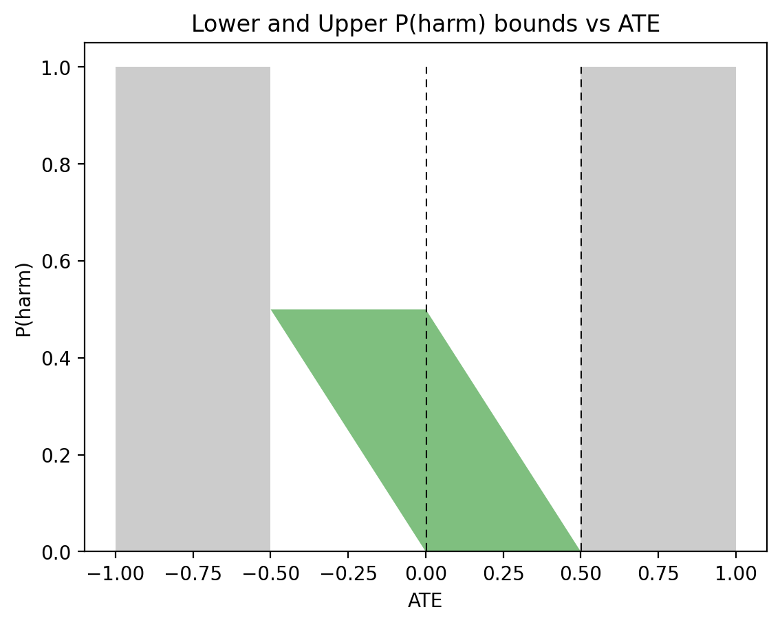
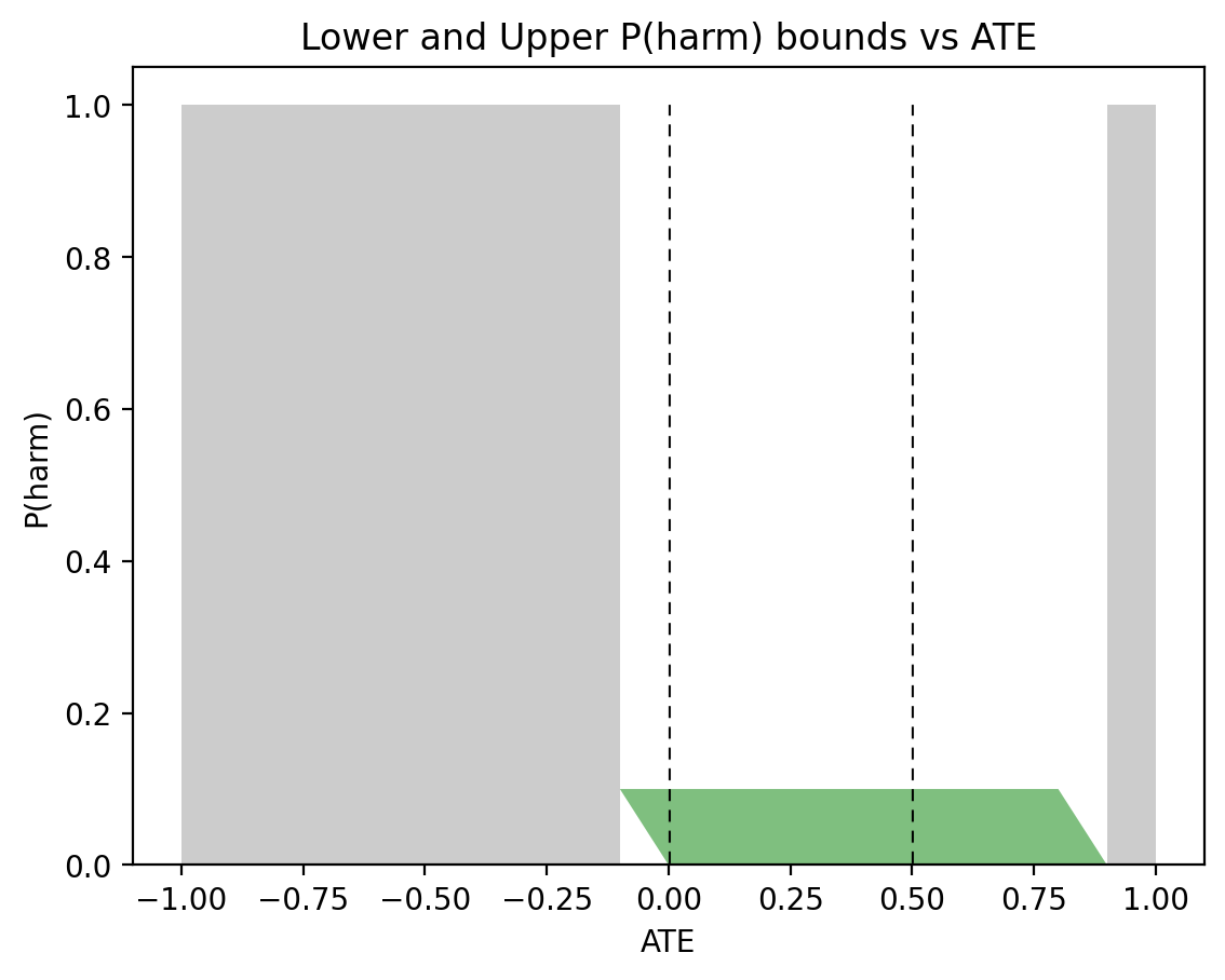
In the past two days I have been engaged in discussions regarding Andrew Gelman’s review of Book of Why.

These discussions unveils some of our differences as well as some agreements. I am posting some of the discussions below, because Gelman’s blog represents the thinking of a huge segment of practicing statisticians who are, by and large, not very talkative about causation. It is interesting therefore to understand how they think, and what makes them tick.


Judea Pearl says: January 12, 2019 at 8:24 am

Andrew,
I appreciate your kind invitation to comment on your blog. Let me start with a Tweet that I posted on https://twitter.com/yudapearl

(updated 1.10.19)
1.8.19 @11:59pm – Gelman’s review of #Bookofwhy should be of interest because it represents an attitude that paralyzes wide circles of statistical researchers. My initial reaction is now posted on https://bit.ly/2H3BH3b Related posts: https://ucla.in/2sgzkPZ and https://ucla.in/2v72QK5

These postings speak for themselves but I would like to respond here to your recommendation: “Similarly, I’d recommend that Pearl recognize that the apparatus of statistics, hierarchical regression modeling, interactions, post-stratification, machine learning, etc etc solves real problems in causal inference.”

It sounds like a mild and friendly recommendation, and your readers would probably get upset at anyone who would be so stubborn as to refuse it.

But I must. Because, from everything I know about causation, the apparatus you mentioned does NOT, and CANNOT solve any problem known as “causal” by the causal-inference community (which includes your favorites Rubin, Angrist, Imbens, Rosenbaum, etc etc.). Why?

Because the solution to any causal problem must rest on causal assumptions and the apparatus you mentioned has no representation for such assumptions.

1. Hierarchical models are based on set-subset relationships, not causal relationships.

2. “interactions” is not an apparatus unless you represent them in some model, and act upon them.

3. “post-stratification” is valid only after you decide what you stratify on, and this requires a causal structure (which you claim above to be an unnecessary “wrapping” and complication”)

4. “Machine learning” is just fancy curve fitting of data see https://ucla.in/2umzd65

Thus, what you call “statistical apparatus” is helpless in solving causal problems. We came to this juncture several times in the past and, invariably, you pointed me to books, articles, and elaborated works which, in your opinion, do solve “real life causal problems”. So, how are we going to resolve our disagreement on whether those “real life” problems are “causal” and, if they are, whether your solution of them is valid. I suggested applying your methods to toy problems whose causal character is beyond dispute. You did not like this solution, and I do not blame you, because solving ONE toy problem will turn your perception of causal analysis upside down. It is frightening. So I would not press you. But I will add another Tweet before I depart:

1.9.19 @2:55pm – An ounce of advice to readers who comment on this “debate”: Solving one toy problem in causal inference tells us more about statistics and science than ten debates, no matter who the debaters are. #Bookofwhy

Addendum. Solving ONE toy problem will tells you more than dozen books and articles and multi-cited reports. You can find many such toy problems (solved in R) here: https://ucla.in/2KYYviP sample of solution manual: https://ucla.in/2G11xUE

For your readers convenience, I have provided free access to chapter 4 here: https://ucla.in/2G2rWBv It is about counterfactuals and, if I were not inhibited by modesty, I would confess that it is the best text on counterfactuals and their applications that you can find anywhere.

I hope you take advantage of my honesty.
Enjoy
Judea


Andrew says: January 12, 2019 at 11:37 am

Judea:

We are in agreement. I agree that data analysis alone cannot solve any causal problems. Substantive assumptions are necessary too. To take a familiar sort of example, there are people out there who just think that if you fit a regression of the form, y = a + bx + cz + error, that the coefficients b and c can be considered as causal effects. At the level of data analysis, there are lots of ways of fitting this regression model. In some settings with good data, least squares is just fine. In more noisy problems, you can do better with regularization. If there is bias in the measurements of x, z, and y, that can be incorporated into the model also. But none of this legitimately gives us a causal interpretation until we make some assumptions. There are various ways of expressing such assumptions, and these are talked about in various ways in your books, in the books by Angrist and Pischke, in the book by Imbens and Rubin, in my book with Hill, and in many places. Your view is that your way of expressing causal assumptions is better than the expositions of Angrist and Pischke, Imbens and Rubin, etc., that are more standard in statistics and econometrics. You may be right! Indeed, I think that for some readers your formulation of this material is the best thing out there.

Anyway, just to say it again: We agree on the fundamental point. This is what I call in the above post the division of labor, quoting Frank Sinatra etc. To do causal inference requires (a) assumptions about causal structure, and (b) models of data and measurement. Neither is enough. And, as I wrote above:

I agree with Pearl and Mackenzie that typical presentations of statistics, econometrics, etc., can focus way too strongly on the quantitative without thinking at all seriously about the qualitative aspects of the problem. It’s usually all about how to get the answer given the assumptions, and not enough about where the assumptions come from. And even when statisticians write about assumptions, they tend to focus on the most technical and least important ones, for example in regression focusing on the relatively unimportant distribution of the error term rather than the much more important concerns of validity and additivity.

If all you do is set up probability models, without thinking seriously about their connections to reality, then you’ll be missing a lot, and indeed you can make major errors in casual reasoning . . .

Where we disagree is just on terminology, I think. I wrote, “the apparatus of statistics, hierarchical regression modeling, interactions, poststratification, machine learning, etc etc., solves real problems in causal inference.” When I speak of this apparatus, I’m not just talking about probability models; I’m also talking about assumptions that map those probability models to causality. I’m talking about assumptions such as those discussed by Angrist and Pischke, Imbens and Rubin, etc.—and, quite possibly, mathematically equivalent in these examples to assumptions expressed by you.

So, to summarize: To do causal inference, we need (a) causal assumptions (assumptions of causal structure), and (b) models or data analysis. The statistics curriculum spends much more time on (b) than (a). Econometrics focuses on (a) as well as (b). You focus on (a). When Angrist, Pischke, Imbens, Rubin, Hill, me, and various others do causal inference, we do both (a) and (b). You argue that if we were to follow your approach on (a), we’d be doing better work for those problems that involve causal inference. You may be right, and in any case I’m glad you and Mackenzie wrote this book which so many people have found helpful, just as I’m glad that the aforementioned researchers wrote their books on causal inference which so many have found helpful. A framework for causal inference—whatever that framework may be—is complementary to, not in competition with, data-analysis tools such as hierarchical modeling, poststratification, machine learning, etc.

P.S. I’ll ignore the bit in your comment where you say you know what is “frightening” to me.


Judea Pearl says: January 13, 2019 at 6:59 am

Andrew,

I would love to believe that where we disagree is just on terminology. Indeed, I see sparks of convergence in your last post, where you enlighten me to understand that by “the apparatus of statistics, …’ you include the assumptions that PO folks (Angrist and Pischke, Imbens and Rubin etc.) are making, namely, assumptions of conditional ignorability. This is a great relief, because I could not see how the apparatus of regression, interaction, post-stratification or machine learning alone, could elevate you from rung-1 to rung-2 of the Ladder of Causation. Accordingly, I will assume that whenever Gelman and Hill talk about causal inference they tacitly or explicitly make the ignorability assumptions that are needed to take them
from associations to causal conclusions. Nice. Now we can proceed to your summary and see if we still have differences beyond terminology.

I almost agree with your first two sentences: “So, to summarize: To do causal inference, we need (a) causal assumptions (assumptions of causal structure), and (b) models or data analysis. The statistics curriculum spends much more time on (b) than (a)”.

But we need to agree that just making “causal assumptions” and leaving them hanging in the air is not enough. We need to do something with the assumptions, listen to them, and process them so as to properly guide us in the data analysis stage.

I believe that by (a) and (b) you meant to distinguish identification from estimation. Identification indeed takes the assumptions and translate them into a recipe with which we can operate on the data so as to produce a valid estimate of the research question of interest. If my interpretation of your (a) and (b) distinction is correct, permit me to split (a) into (a1) and (a2) where (a2) stands for identification.

With this refined-taxonomy, I have strong reservation to your third sentence: “Econometrics focuses on (a) as well as (b).” Not all of econometrics. The economists you mentioned, while commencing causal analysis with “assumptions” (a1), vehemently resist to organizing these assumptions in any “structure”, be it a DAG or structural equations (Some even pride themselves of being “model-free”). Instead, they restrict their assumptions to conditional ignorability statements so as to justify familiar estimation routines. [In https://ucla.in/2mhxKdO, I labeled them: “experimentalists” or “structure-free economists” to be distinguished from “structuralists” like Heckman, Sims, or Matzkin.]

It is hard to agree therefore that these “experimentalists” focus on (a2) — identification. They actually assume (a2) away rather than use it to guide data analysis.

Continuing with your summary, I read: “You focus on (a).” Agree. I interpret (a) to mean (a) = (a1) + (a2) and I let (b) be handled by smart statisticians, once they listen to the guidance of (a2).

Continuing, I read:
“When Angrist, Pischke, Imbens, Rubin, Hill, me, and various others do causal inference, we do both (a) and (b). Not really. And it is not a matter of choosing “an approach”. By resisting structure, these researchers a priori deprive themselves of answering causal questions that are identifiable by do-calculus and not by a single conditional ignorability assumption. Each of those questions may require a different estimand, which means that you cannot start doing the “data analysis” phase before completing the identification phase. 

[Currently, even questions that are identifiable by conditional ignorability assumption cannot be answered by structure-free PO folks, because deciding on the conditioning set of covariates is intractable without the aid of DAGs, but this is a matter of efficiency not of essence.]

But your last sentence is hopeful:
“A framework for causal inference — whatever that that framework may be — is complementary to, not in competition with, data-analysis tools such as hierarchical modeling, post-stratification, machine learning, etc.”

Totally agree, with one caveat: the framework has to be a genuine “framework,” ie, capable of leverage identification to guide data-analysis.

Let us look now at why a toy problem would be frightening; not only to you, but to anyone who believes that the PO folks are offering a viable framework for causal inference.

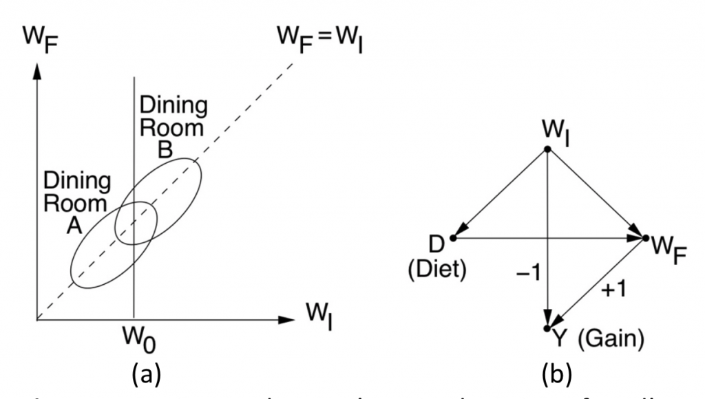
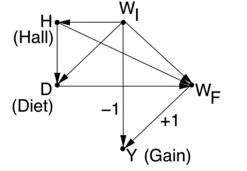
Lets take the simplest causal problem possible, say a Markov chain X —>Z—>Y with X standing for Education, Z for Skill and Y for Salary. Let Salary be determined by Skill only, regardless of Education. Our research problem is to find the causal effect of Education on Salary given observational data of (perfectly measured) X,Y,Z.

To appreciate the transformative power of a toy example, please try to write down how Angrist, Pischke, Imbens, Rubin, Hill, would go about doing (a) and (b) according to your understanding of their framework. You are busy, I know, so let me ask any of your readers to try and write down step by step how the graph-less school would go about it. Any reader who tries this exercise ONCE will never be thesame. It is hard to believe unless you actually go through this frightening exercise, please try. 

Repeating my sage-like advice: Solving one toy problem in causal inference tells us more about statistics and science than ten debates, no matter who the debaters are.
Try it.

[Judea Pearl added in editing: I have received no solution  thus far, not even an attempt. For readers of this blog, the chain is part of the front-door model which is treated in Causality pp. 232-4, in both graphical and potential outcome frameworks. I have yet to meet a PO researcher who can formulate this toy story in PO, let alone solve it. Not because they can’t, but because the very idea of listening to their  understanding of a problem and translating that understanding to formal assumption is foreign to them, having been conditioned to assume ignorability and estimate a quantity that is easily estimable]


Andrew says:January 13, 2019 at 8:26 pm

Judea:

I think we agree on much of the substance. And I agree with you regarding “not all econometrics” (and, for that matter, not all of statistics, not all of sociology, etc.). As I wrote in my review of your book with Mackenzie, and in my review of Angrist and Pischke’s book, causal identification is an important topic and worth its own books.

In practice, our disagreement is, I think, that we focus on different sorts of problems and different sorts of methods. And that’s fine! Division of labor. You have toy problems that interest you, I have toy problems that interest me. You have applied problems that interest you, I have applied problems that interest me. I would not expect you to come up with methods of solving the causal inference problems that I work on, but that’s OK: your work is inspirational to many people and I can well believe it has been useful in certain applications as well as in developing conceptual understanding. I consider toy problems of my own for that same reason. I’m not particularly interested in your toy problems, but that’s fine; I doubt you’re particularly interested in the problems I focus on. It’s a big world out there.

In the meantime, you continue to characterize me as being frightened or lacking courage. I wish you’d stop doing that.

[Judea Pearl added in editing: Gelman wants to move identification to separate books, because it is important, but the fact that one cannot start estimation before having an identifiable estimand is missing from his comment. Is he aware of it? Does he really do estimation before identification? I do not know, it is a foreign culture to me.]


Judea Pearl says: January 13, 2019 at 10:51 pm

Andrew,
Convergence is in sight, modulo two corrections:
1. You say:
“You [Pearl] have toy problems that interest you, I [Andrew] have toy problems that interest me. …I doubt you’re particularly interested in the problems I focus on. ”
Wrong! I am very interested in your toy problems, especially those with causal flavor. Why? Because I love to challenge the SCM framework with new tasks and new angles that other researchers found to be important, and see if SCM can be enriched with expanded scope. So, by all means, if you have a new twist, shoot. I have not been able to do it in the past, because your shots were not toy-like, e.g., 3-4 variables, clear task, with correct answer known.

2. You say:
“you continue to characterize me as being frightened or lacking courage” This was not my intention. My last remark on frightening toys was general, everyone is frightened by the honesty and transparency of toys — the adequacy of one’s favorite method is undergoing a test of fire. Who wouldn’t be frightened? But, since you prefer, I will stop using this metaphor.

3. Starting afresh, and the sake of good spirit: How about attacking a toy problem? Just for fun, just for sport.


Andrew says: January 13, 2019 at 11:24 pm

Judea:

I’ve attacked a lot of toy problems.

For an example of a toy problem in causality, see pages 962-963 of this article.

But most of the toy problems I’ve looked at do not involve causality; see for example this paper, item 4 in this post, and this paper.  This article on experimental design is simple enough that I think it could count as a toy problem: it’s a simple example without data which allows us to compare different methods. And here’s a theoretical paper I wrote awhile ago that has three toy examples. Not involving causal inference, though.

I’ve written lots of papers with causal inference, but they’re almost all applied work. This may be because I consider myself much more of a practitioner of causal inference than a researcher on causal inference. To the extent I’ve done research on causal inference, it’s mostly been to resolve some confusions in my mind (as in this paper).

This gets back to the division-of-labor thing. I’m happy for you and Imbens and Hill and Robins and VanderWeele and others to do research on fundamental methods for causal inference, while I do research on statistical analysis. The methods that I’ve learned have allowed my colleagues and I to make progress on a lot of applied problems in causal inference, and have given me some clarity in understanding problems with some naive formulations of causal reasoning (as in the first reference above in this comment).

[Judea Pearl. Added in editing: Can one really make progress on a lot of applied problems in causal inference without dealing with identification Evidently, PO folks think so, at least those in Gelman’s circles]

As I wrote in my above post, I think your book with Mackenzie has lots of great things in it; I just can’t go with a statement such as, “Using a calculus of cause and effect developed by Pearl and others, scientists now have the ability to answer such questions as whether a drug cured an illness, when discrimination is to blame for disparate outcomes, and how much worse global warming can make a heat wave”—because scientists have been answering such questions before Pearl came along, and scientists continue to answer such questions using methods other than Pearl’s. For what it’s worth, I don’t think the methods that my colleagues and I have developed are necessary for solving these or any problems. Our methods are helpful in some problems, some of the time, at least until something better comes along—I think that’s pretty much all that any of us can hope for! That, and we can hope that our writings inspire new researchers to come up with new methods that are useful in the future.


Judea Pearl says:January 14, 2019 at 2:18 am

Andrew,
Agree to division of labor: causal inference on one side and statistical analysis on the other.

Assuming that you give me some credibility on the first, let me try and show you that even the publisher advertisement that you mock with disdain is actually true and carefully expressed. It reads: “Using a calculus of cause and effect developed by Pearl and others, scientists now have the ability to answer such questions as whether a drug cured an illness, when discrimination is to blame for disparate outcomes, and how much worse global warming can make a heat wave”.

First, note that it includes “Pearl and others”, which theoretically might include the people you have in mind. But it does not; it refers to those who developed mathematical formulation and mathematical tools to answer such questions. So let us examine the first question: “whether a a drug cured an illness”. This is a counterfactual “cause of effect” type question. Do you know when it was first formulated mathematically? [Don Rubin declared it non-scientific].

Now lets go to the second: “when discrimination is to blame for disparate outcomes,” This is a mediation problem. Care to guess when this problem was first formulated (see Book of Why chapter 9) and what the solution is Bottom line, Pearl is not as thoughtless as your review portrays him to be and, if you advise your readers to control their initial reaction: “Hey, statisticians have been doing it for centuries” they would value learning how things were first formulated, first solved and why statisticians were not always the first.


Andrew says:January 14, 2019 at 6:46 pm

Judea:

I disagree with your implicit claim that, before your methods were developed, scientists were not able to answer such questions as whether a drug cured an illness, when discrimination is to blame for disparate outcomes, and how much worse global warming can make a heat wave. I doubt much will be gained by discussing this particular point further so I’m just clarifying that this is a point of disagreement.

Also, I don’t think in my review I portrayed you as thoughtless. My message was that your book with Mackenzie is valuable and interesting even though it has some mistakes. In my review I wrote about the positive part as well as the mistakes. Your book is full of thought!

[Judea Pearl. Added in edit: Why can’t Gelman  “go with a statement such as, “Using a calculus of cause and effect developed by Pearl and others, scientists now have the ability to answer such questions as whether a drug cured an illness, when discrimination is to blame for disparate outcomes, and how much worse global warming can make a heat wave”? His answer is: “because scientists have been answering such questions before Pearl came along” True, by trial and error, but not by mathematical analysis. And my statement marvels at the ability of doing it analytically. So why can’t Gelman acknowledge that a marvelous progress has been made, not by me, but by several researchers who realized that graph-less PO is a deadend.?]

January 9, 2019

Can causal inference be done in statistical vocabulary?

Filed under: Uncategorized — Judea Pearl @ 6:59 am

Andrew Gelman has just posted a review of The Book of Why (https://andrewgelman.com/2019/01/08/book-pearl-mackenzie/), my answer to some of his comments follows below:

“Andrew, 

The hardest thing for people to snap out of is the bubble of their own language. You say: “I find it baffling that Pearl and his colleagues keep taking statistical problems and, to my mind, complicating them by wrapping them in a causal structure (see, for example, here).” 

No way! and again: No way! There is no way to answer causal questions without snapping out of statistical vocabulary.  I have tried to demonstrate it to you in the past several years, but was not able to get you to solve ONE toy problem from beginning to end. 

This will remain a perennial stumbling block until one of your readers tries honestly to solve ONE toy problem from beginning to end. No links to books or articles, no naming of fancy statistical techniques, no global economics problems, just a simple causal question whose answer we know in advance. (e.g. take Simpson’s paradox: Which data should be consulted? The aggregated or the disaggregated?) 

Even this group of 73 Editors found it impossible, and have issued the following guidelines for reporting observational studies: https://www.atsjournals.org/doi/pdf/10.1513/AnnalsATS.201808-564PS

To readers of your blog: Please try it. The late Dennis Lindley was the only statistician I met who had the courage to admit:  “We need to enrich our language with a do-operator”. Try it, and you will see why he came to this conclusion, and perhaps you will also see why Andrew is unable to follow him.”

Addendum:

In his response to my comment above, Andrew Gelman suggested that we agree to disagree, since science is full of disagreements and there is lots of room for progress using different methods. Unfortunately, the need to enrich statistics with new vocabulary is a mathematical fact, not an opinion. This need cannot be resolved by “there are many ways to skin a cat” without snapping out of traditional statistical language and enriching it  with causal vocabulary.  Neyman-Rubin’s potential outcomes vocabulary is an example of such enrichment, since it goes beyond joint distributions of observed variables.

Andrew further refers us to three chapters in his book (with Jennifer Hill) on causal inference. I am craving instead for one toy problem, solved from assumptions to conclusions, so that we can follow precisely the roll played by the extra-statistical vocabulary, and why it is absolutely needed. The Book of Why presents dozen such examples, but readers would do well to choose their own.

September 15, 2016

Summer-end Greeting from the UCLA Causality Blog

Filed under: Uncategorized — bryantc @ 4:39 am

Dear friends in causality research,
—————————————
This greeting from UCLA Causality blog contains news and discussion on the following topics:

1. Reflections on 2016 JSM meeting.
2. The question of equivalent representations.
3. Simpson’s Paradox (Comments on four recent papers)
4. News concerning Causal Inference Primer
5. New books, blogs and other frills.

1. Reflections on JSM-2016
—————————————
For those who missed the JSM 2016 meeting, my tutorial slides can be viewed here: http://bayes.cs.ucla.edu/jsm-august2016.ppt

As you can see, I argue that current progress in causal inference should be viewed as a major paradigm shift in the history of statistics and, accordingly, nuances and disagreements are merely linguistic realignments within a unified framework. To support this view, I chose for discussion six specific achievements (called GEMS) that should make anyone connected with causal analysis proud, empowered, and mighty motivated.

The six gems are:
1. Policy Evaluation (Estimating “Treatment Effects”)
2. Attribution Analysis (Causes of Effects)
3. Mediation Analysis (Estimating Direct and Indirect Effects)
4. Generalizability (Establishing External Validity)
5. Coping with Selection Bias
6. Recovering from Missing Data

I hope you enjoy the slides and appreciate the gems.

2. The question of equivalent representations
—————————————
One challenging question that came up from the audience at JSM concerned the unification of the graphical and potential-outcome frameworks. “How can two logically equivalent representations be so different in actual use?”. I elaborate on this question in a separate post titled “Logically equivalent yet way too different.” http://causality.cs.ucla.edu/blog/index.php/2016/09/12/

3. Simpson’s Paradox: The riddle that would not die
(Comments on four recent papers)
—————————————
If you search Google for “Simpson’s paradox”, as I did yesterday, you would get 111,000 results, more than any other statistical paradox that I could name. What elevates this innocent reversal of associations to “paradoxical” status, and why it has captured the fascination of statisticians, mathematicians and philosophers for over a century are questions that we discussed at length on this (and other) blogs. The reason I am back to this topic is the publication of four recent papers that give us a panoramic view at how the understanding of causal reasoning has progressed in communities that do not usually participate in our discussions.  http://causality.cs.ucla.edu/blog/index.php/2016/08/24/

4. News concerning Causal Inference – A Primer
—————————————
We are grateful to Jim Grace for his in-depth review on Amazon: https://www.amazon.com/gp/customer-reviews/R2T3OB4WRGRRC0/ref=cm_cr_dp_d_rvw_ttl?ie=UTF8&ASIN=1119186846

For those of you awaiting the solutions to the study questions in the Primer, http://bayes.cs.ucla.edu/PRIMER/ I am informed that the Solution Manual is now available (to instructors) from Wiley. To obtain a copy, see page 2 of: http://bayes.cs.ucla.edu/PRIMER/CIS-Manual-PUBLIC.pdf However, rumor has it that a quicker way to get it is through your local Wiley representative, at https://professor.wiley.com/CGI-BIN/LANSAWEB?PROCFUN+PROF1+PRFFN15

If you encounter difficulties, please contact us at causality.ucla@gmail.com and we will try to help. Readers tell me that the solutions are more enlightening than the text. I am not surprised, there is nothing more invigorating than seeing a non-trivial problem solved from A to Z.

5. New books, blogs and other frills
—————————————
5.1
We are informed that a new book by Joseph Halpern, titled “Actual Causality”, is available now from MIT Press. (https://www.amazon.com/Actual-Causality-Press-Joseph-Halpern/dp/0262035022). Readers familiar with Halpern’s fundamental contributions to causal reasoning will not be surprised to find here a fresh and comprehensive solution to the age-old problem of actual causality. Not to be missed.

5.2
Adam Kelleher writes about an interesting math-club and causal-minded blog that he is orchestrating. See his post, http://causality.cs.ucla.edu/blog/index.php/2016/09/11/

5.3
Glenn Shafer just published a review paper: “A Mathematical Theory of Evidence turn 40” celebrating the 40th anniversary of the publication of his 1976 book “A Mathematical Theory of Evidence” http://www.glennshafer.com/assets/downloads/MathTheoryofEvidence-turns-40.pdf I have enjoyed reading this article for nostalgic reasons, reminding me of the stormy days in the 1980’s, when everyone was arguing for another calculus of evidential reasoning. My last contribution to that storm, just before sailing off to causality land, was this paper: http://ftp.cs.ucla.edu/pub/stat_ser/r136.pdf. Section 10 of Shafer’s article deals with his 1996 book “The Art of Causal Conjecture” My thought: Now, that the causal inference field has matured, perhaps it is time to take another look at the way Shafer views causation.

Wishing you a super productive Fall season.

J. Pearl

Next Page »

Powered by WordPress